Section 7 Correlation Analysis
As we know by now, observational studies are defined as those studies in which the researcher does not manipulate the treatment but rather observes data from events that have already occurred, presenting a contrasting set of challenges and advantages compared to experimental research designs. One major advantage is their greater generalizability or external validity. This stems from the fact that these studies typically gather data from real-world settings, free from the controlled conditions of experimental setups. Consequently, their findings might more accurately mirror real-world phenomena and be more representative of the broader population. Additionally, many observational studies draw from extensive datasets or databases, capturing a diverse range of participants and contexts, further boosting their generalizability. On the flip side, their primary disadvantage lies in their lower internal validity. Without the controlled manipulation characteristic of experimental designs, it becomes challenging to establish clear cause-and-effect relationships. In observational studies, other unmeasured or uncontrolled variables could influence the outcomes, introducing potential confounds.
In the following section, we will examine a method for evaluating the strength and direction of the linear relationship between two variables, known as correlation analysis. Specifically, we will apply the Pearson correlation coefficient (Pearson’s r), a widely used metric for measuring correlation. For a refresher on correlation, please refer to the Week 7 lecture materials. The correlation analysis below will provide the basis for more advanced analyses of linear relationships in subsequent sections, where we will explore the assumptions and complexities of multivariate relationships and address challenges posed by potential confounding factors.
Allocating Portfolios: The Formation of Coalition Governments
In multiparty systems—systems where more than two political parties have a realistic chance of holding power—it’s often observed that no single party secures an absolute majority of seats in the national legislature after parliamentary elections. This scenario typically prompts heads of government to form coalitions to govern effectively. Such coalition formations inevitably involve negotiations among party elites to determine the government’s composition and the allocation of ministerial portfolios, known as government departments in Australia.
In parliamentary democracies, evidence suggests that ministerial portfolios tend to be allocated among coalition parties roughly in proportion to the legislative seats each coalition party contributes to the government. A perfectly proportional distribution, often referred to as Gamson’s Law (1961) or one-to-one proportionality, describes a scenario where coalition parties receive portfolio shares directly proportional to their contributions of legislative seats to the coalition government. In such a scenario, for instance, a coalition party with 10% of parliamentary seats would likely secure 10% of the ministerial portfolios in the government’s executive cabinet.
Using data provided by Warwick and Druckman (2006), we will assess the relationship between the percentage of portfolios held by coalition parties (variable portfolio_share) and the percentage of legislative seats these parties contribute to the coalition government (variable legislative_share). Th dataset comprises 807 observations, with the coalition party level serving as the unit of analysis, spanning coalition governments in 14 European countries from 1945 to 2000. The dataset can be accessed from the coalitions.csv file.
# Read and store the data
coalitions <- read.csv("http://thiagosilvaphd.com/pols_8042/coalitions.csv")
Below, we provide the code to retrieve specific details from the dataset, accompanied by annotations to describe each function.
names(coalitions) # extract the variables' names
## [1] "X"                 "countryname"       "year"
## [4] "party_id"          "legislative_share" "portfolio_share"

# Extract distinct values from a dataframe, in this case the names of the countries included in the data set
unique(coalitions$countryname)
##  [1] "Austria"     "Belgium"     "Denmark"     "Finland"     "France"
##  [6] "Iceland"     "Ireland"     "Italy"       "Luxembourg"  "Netherlands"
## [11] "Norway"      "Portugal"    "Sweden"      "Germany"

dim(coalitions) # determines the dataset's dimensions
## [1] 807   6

head(coalitions) # view the first six rows
##   X countryname year party_id legislative_share portfolio_share
## 1 1     Austria 1945        1          2.424242        5.277286
## 2 2     Austria 1945        2         46.060606       37.894797
## 3 3     Austria 1945        3         51.515152       56.827917
## 4 4     Austria 1947        1         47.204969       43.172083
## 5 5     Austria 1947        2         52.795031       56.827917
## 6 6     Austria 1949        1         46.527778       42.920779

summary(coalitions) # computes descriptive statistics
##        X         countryname             year         party_id
##  Min.   :  1.0   Length:807         Min.   :1945   Min.   : 1.000
##  1st Qu.:202.5   Class :character   1st Qu.:1962   1st Qu.: 1.000
##  Median :404.0   Mode  :character   Median :1974   Median : 2.000
##  Mean   :404.0                      Mean   :1974   Mean   : 2.616
##  3rd Qu.:605.5                      3rd Qu.:1986   3rd Qu.: 3.000
##  Max.   :807.0                      Max.   :1999   Max.   :14.000
##  legislative_share portfolio_share
##  Min.   : 1.117    Min.   : 1.779
##  1st Qu.:12.305    1st Qu.:14.664
##  Median :26.471    Median :30.207
##  Mean   :33.209    Mean   :33.209
##  3rd Qu.:49.682    3rd Qu.:47.967
##  Max.   :97.152    Max.   :93.254
Based on the outputs provided above, can you answer the following questions?
- How do you interpret the dataset’s first observation?
- For every variable: Can you identify its type, and its minimum and maximum values?
- Since the data is at the coalition party level, can you deduce the purpose of the variable party_id?”
To assess the distributions and relationship between legislative_share and portfolio_share in our sample, we’ll start by generating histograms for each variable. Following that, we’ll use a scatter plot to illustrate the covariation between them. After these visual representations, we’ll quantify the direction and strength of their relationship by computing a correlation coefficient.
# Histogram for legislative_share
ggplot(coalitions, aes(x = legislative_share)) +
  geom_histogram(binwidth = 10, boundary = 0, fill = "steelblue", color = "white") +
  labs(title = "Distribution of Legislative Seats Share",
       subtitle = "Median (vertical yellow line) = 26.47; Mean (vertical red line) = 33.21",
       x = "Legislative Seats Share (%)",
       y = "Count") +
  theme_bw() +
  geom_vline(xintercept = mean(coalitions$legislative_share), color = "red", linetype = "dashed") +
  geom_vline(xintercept = median(coalitions$legislative_share), color = "gold", linetype = "dashed")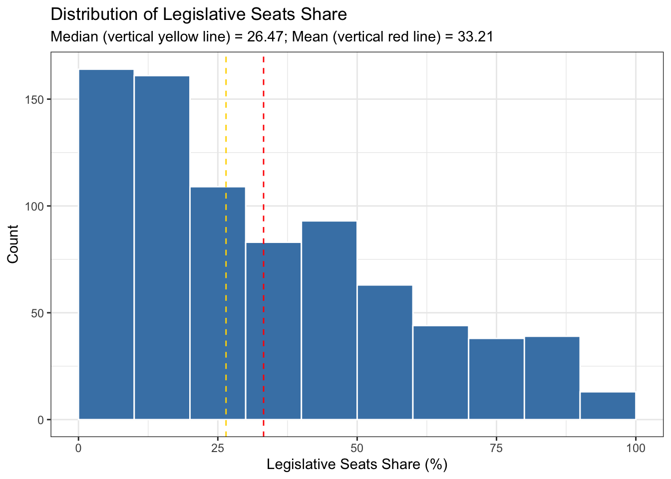
The above histogram depicts the distribution of the legislative seat share that coalition parties contribute to the government (legislative_share), segmented into ten percentage point intervals. The histogram analysis reveals a right-skewed distribution of the variable. Most coalition parties, 164 out of the total, contribute a share between 0% and 10% of the legislative seats, making it the mode. The second most frequent contribution is in the range of 10% to 20%, with 161 coalition parties falling into this category. The median, representing the middle point of the data, is located at 26.47 legislative share (depicted by the vertical yellow line), indicating that the distribution is skewed towards lower seat shares. The mean, expected to be influenced by the right-skew, falls at 33.21. Overall, the histogram indicates that as the contribution percentage increases, the frequency generally decreases, with a few fluctuations; for instance, there’s a slight increase in the 40% to 50% range with 93 parties. Given the multiparty nature of the systems included in the dataset, it’s unsurprising that very few, only 13 to be precise, coalition parties contribute between 90% and 100% of the legislative seats to coalition governments. What’s more striking is the presence of parties with such a large percentage of contribution in a coalition setting (a topic we are not covering here).
# Histogram for legislative_share (with geom_vline for vertical lines)
ggplot(coalitions, aes(x = portfolio_share)) +
  geom_histogram(binwidth = 10, boundary = 0, fill = "steelblue", color = "white") +
  labs(title = "Distribution of Portfolio Share",
       subtitle = "Median (vertical yellow line) = 30.21; Mean (vertical red line) = 33.21",
       x = "Portfolio Share (%)",
       y = "Count") +
  theme_bw() +
  geom_vline(xintercept = mean(coalitions$portfolio_share), color = "red", linetype = "dashed") +
  geom_vline(xintercept = median(coalitions$portfolio_share), color = "gold", linetype = "dashed")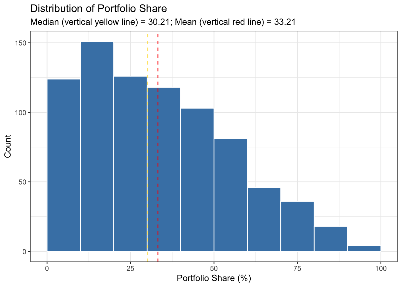
The histogram for portfolio_share illustrates the distribution of the percentage of portfolios held by coalition parties, also segmented into ten percentage point intervals. This histogram analysis also reveals a right-skewed distribution, characterized by a mode in the 10-20% range, with 151 coalition within this range. The median, situated around 30% (see the vertical yellow line), suggests that a significant proportion of coalition parties typically hold relatively small shares of portfolios. The mean, influenced by the right-skewed nature of the distribution, aligns with the mean for legislative_seat, both sharing the value of 32.21%. Despite sharing the same mean, the portfolio_share distribution exhibits less skewness, as indicated by the mean and median being closer together for portfolio_share compared to legislative_share. Overall, the histogram for portfolio_share illustrates that the majority of coalition parties tend to hold portfolios in the lower percentage ranges, with a gradual decline in frequency as the portfolio share percentage increases. There are few fluctuations, such as a slight increase in the 30-40% range, where 118 parties hold portfolios within this range.
A scatter plot enables us to visualize the relationship between the two variables by plotting one variable against the other in the two-dimensional space. Using ggplot2, we can produce a scatter plot using geom_point.
ggplot(coalitions, aes(x = legislative_share, y = portfolio_share)) +
  geom_point() +
  labs(title = "Scatter Plot between Legislative Share (x-axis) and Portfolio Share (y-axis)",
       x = "Legislative Share (%)",
       y = "Portfolio Share (%)") +
  theme_bw()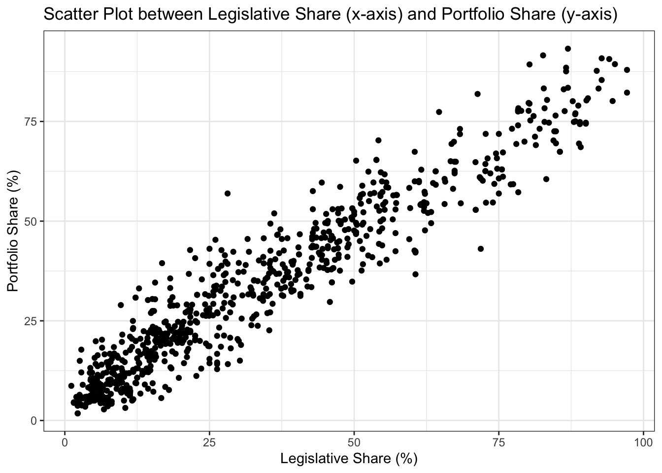
The scatter plot provides a visual representation of the covariation between the legislative share and portfolio share of coalition parties. The positioning of the dots on the plot offers insights into the nature of this covariation. Each dot represents a specific coalition party (an observation): its legislative share is shown on the x-axis and its portfolio share on the y-axis. If all the dots were closely aligned along an upward-sloping line, it would suggest a strong positive covariation: as one variable increases, the other would tend to increase as well, and vice versa. Conversely, if all the dots were closely aligned along an downward-sloping line, it would suggest a strong negative covariation: as one variable increases, the other would tend to decrease, and vice versa. If the dots were spread out without any discernible pattern, it would suggest little to no covariation between the two variables, indicating that changes in one variable are not consistently associated with changes in the other. In our case, the scatter plot displays dots transitioning from the lower-left to the upper-right, indicating a positive covariation between legislative_share and portfolio_share. The closeness of these dots to one another further suggests a strong positive correlation.
It’s important to remember, however, that a scatter plot primarily shows covariation—the extent to which two variables vary together—not correlation—a specific type of covariation that quantifies the linear association between two variables. While a scatter plot can hint at potential correlation (especially if there’s a linear trend), correlation metrics, like Pearson’s r, are needed to quantify the strength and direction of a linear association between the two variables. Moreover, just because a scatter plot may appear random, it doesn’t guarantee the absence of any relationship. There could be non-linear or complex relationships that aren’t immediately obvious, underscoring the importance of additional statistical analyses.
The Pearson correlation coefficient, commonly denoted as \(r\), is one of the most widely used methods for assessing the correlation between two variables. A correlation test quantifies the direction and strength of the linear relationship between two continuous variables. Pearson’s \(r\) ranges from -1 to 1, where:
- 1: Perfect positive linear relationship
- 0: No linear relationship
- -1: Perfect negative linear relationship
The formula for \(r\) is,
\[ r = \frac{\sum (X_i - \bar{X})(Y_i - \bar{Y})}{\sqrt{\sum (X_i - \bar{X})^2 \sum (Y_i - \bar{Y})^2}} \]
Where:
- \(X_i\) and \(Y_i\) are data values,
- \(\bar{X}\) and \(\bar{Y}\) are the means of \(X\) and \(Y\) respectively.
Quantitative methods, including statistical techniques, often rely on assumptions. These assumptions simplify the inherent complexity of real-world data, making it amenable to empirical analysis and interpretation. By setting certain conditions—like normality or linearity—researchers can generalize findings, ensuring that the derived conclusions are both meaningful and applicable. The main assumptions for Pearson’s r are:
- Both variables are continuous and approximately normally distributed.
- A linear relationship exists between the two variables.
- Homoscedasticity is present, meaning the variance of one variable remains stable across the levels of the other variable.
To compute \(r\) in R, you can use the cor() function:
# Compute correlation
cor(coalitions$legislative_share, coalitions$portfolio_share)
## [1] 0.9546205
Alternatively, if you suspect missing values in the data, it’s prudent to use the cor() function in combination with na.omit(). This ensures that any row with missing values in either of the specified columns gets omitted from the correlation computation. (For more detail, please refer to the section 5.2 Handling Missing Data in R in Section 5.) In the code snippet provided below, the expression inside [c()], i.e., [c("legislative_share", "portfolio_share")], is used to subset specific columns from the dataframe coalitions. Here, we’re selecting just the two columns legislative_share and portfolio_share to be part of the correlation matrix. If you have more variables and want them all in the same correlation matrix, you simply extend the vector inside c().
# Compute correlation without missing values (if any)
cor(na.omit(coalitions)[c("legislative_share", "portfolio_share")])
##                   legislative_share portfolio_share
## legislative_share         1.0000000       0.9546205
## portfolio_share           0.9546205       1.0000000
If the output matches our prior computation, it suggests there weren’t any missing values affecting our result. Nonetheless, it’s always important to initially inspect and understand your dataset, ensuring missing values are appropriately handled in subsequent operations.
The calculated correlation coefficient between our variables is approximately \(r = 0.9546205\). This value of \(r\) indicates a very strong positive linear relationship between legislative_share and portfolio_share. As the legislative_share increases, the portfolio_share also tends to increase, and vice versa. As 0.9546205 is very close to 1, we can infer a high degree of linear association between the two variables.
In statistical analysis, determining the correlation coefficient between two variables, like Pearson’s \(r\), is only the first step. It’s essential to ascertain whether the observed correlation is statistically significant, meaning the relationship is unlikely due to random chance. To assess this, we conduct a hypothesis test. The default null hypothesis typically asserts that there’s no correlation between the variables (i.e., \(r = 0\)). If this test is statistically significant, often at a 95% confidence level, it provides evidence against the null hypothesis, suggesting that the observed correlation is not a product of random variability in the sample. In this case, we can assert with 95% confidence that the observed relationship does not seem to be merely coincidental, but rather indicative of an association within the broader population represented by our sample. In R, to test the significance of the correlation, we can use the cor.test() function.
cor.test(coalitions$legislative_share, coalitions$portfolio_share)
##
##  Pearson's product-moment correlation
##
## data:  coalitions$legislative_share and coalitions$portfolio_share
## t = 90.943, df = 805, p-value < 2.2e-16
## alternative hypothesis: true correlation is not equal to 0
## 95 percent confidence interval:
##  0.9480673 0.9603635
## sample estimates:
##       cor
## 0.9546205
The cor.test() function provided the Pearson’s product-moment correlation between legislative_share and portfolio_share, yielding a t-statistic of 90.943 with 805 degrees of freedom. This t-statistic evaluates the null hypothesis that the population correlation is 0. Given the exceptionally low p-value (less than 2.2e-16), we have evidence, even at the 95% confidence level, to reject this null hypothesis. This suggests that, at the same confidence level, the observed correlation between legislative_share and portfolio_share isn’t merely by chance, but represents a true association in the population from which our sample was drawn. Additionally, the confidence interval for the correlation coefficient is 0.9480673 to 0.9603635, indicating that we are 95% confident that the true population correlation lies within this interval.
The cor.test() conducted suggests a statistically significant strong positive correlation between legislative_share and portfolio_share of approximately 0.9546205. Beyond the statistical significance, it is important to provide or interpret the substantive significance of our results, highlighting the real-world implications they present. Specifically, in this case, we can infer that as the legislative_share increases, the portfolio_share tends to increase proportionally, providing evidence for Gamson’s Law, that is, that parties receive a proportionate share of portfolios based on their seat share contribution during the coalition government formation process.