Section 4 Exploring the Data and Graphical Visualizations
Consider we were interested in the following research question: Does social pressure affect voting turnout?
Political scientists Alan Gerber, Donald Green, and Christopher Larimer were precisely interested in this question in their study, “Social Pressure and Voter Turnout: Evidence from a Large-Scale Field Experiment,” which was published in the American Political Science Review (2008, volume 102, issue 1). In their experimental design, a sample of registered voters in Michigan was randomly assigned to either:
- Receive a message designed to induce social pressure to vote (the treatment group), or
- Receive nothing (the control group).
The message told registered voters that after the election their neighbors would be informed about whether they voted in the election or not:
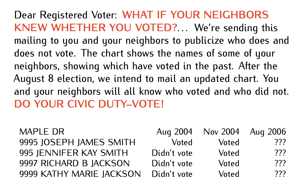
Figure 4.1: Go Vote Message
The dataset can be accessed from the voting.csv file. Below is a table outlining the variable names and their descriptions.
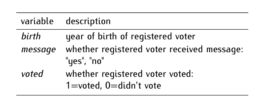
Figure 4.2: Codebook: Social Pressure and Turnout
As usual, we start by exploring the data. In sequence, we examine the content and distribution of variables in our data, following these steps:
- Explore the data.
- Create a table of frequencies.
- Create a table of proportions.
- Create a histogram.
- Compute descriptive statistics.
# STEP 0. Load the dataset
voting <- read.csv("http://thiagosilvaphd.com/pols_8042/voting.csv") # reads and stores data
4.1 STEP 1: Explore the data
dim(voting) # returns the dimensions of an object (rows [observations] and columns [variables])
## [1] 229444      3

head(voting) # shows the first six observations
##   birth message voted
## 1  1981      no     0
## 2  1959      no     1
## 3  1956      no     1
## 4  1939     yes     1
## 5  1968      no     0
## 6  1967      no     0

glimpse(voting) # a more detailed preview than head
## Rows: 229,444
## Columns: 3
## $ birth   <int> 1981, 1959, 1956, 1939, 1968, 1967, 1941, 1969, 1967, 1961, 19…
## $ message <chr> "no", "no", "no", "yes", "no", "no", "no", "no", "no", "no", "…
## $ voted   <int> 0, 1, 1, 1, 0, 0, 1, 0, 1, 1, 1, 1, 1, 0, 0, 0, 0, 0, 0, 0, 0,…
Based on the outputs provided above, can you answer the following questions?
- How many observations and variables are in the data set?
- What is the unit of observation in the data?
- How would you substantively interpret the first observation?
- For each variable: What are its type and unit of measurement?
4.2 STEP 2: Table of Frequencies
The frequency table of a variable shows the values the variable takes and the number of times each value appears in the variable. For example, we can generate a frequency table for the binary variable voted using the table() function.
The variable voted in the data set denotes whether a registered voter has voted, with “1” representing “voted” and “0” representing “didn’t vote”. Upon examining the above frequency table, we observe that 158,276 individuals opted not to vote, while 71,168 individuals voted. In addition to raw counts, we can use proportions for a standardized comparison and clearer interpretation.
4.3 STEP 3: Table of Proportions
The table of proportions of a variable shows the proportion of observations that take each value in the variable. The proportions in the table should add up to 1. We can generate a table of proportions for the same binary variable voted using the prop.table() function applied to the table() output, as demonstrated below:
In the sample under analysis, the voted variable reveals the following distribution: Approximately 68.98% (or 0.6898 when expressed as a proportion) of the registered voters abstained from voting. In contrast, roughly 31.02% (or 0.3102 in proportion) cast their votes. Notably, within this sample, the proportion of non-voters is roughly double that of voters, establishing a 2:1 ratio.
4.4 STEP 4: Histogram
The histogram of a variable is the visual representation of its distribution through bins of different heights. The position of the bins along the x-axis indicate the interval of values. As previously discussed, the base R function hist() allows us to generate histograms. In these visualizations, the height of each bin represents the frequency (or count) corresponding to a specific interval of values. Below, we create histograms for the variables birth and voted.
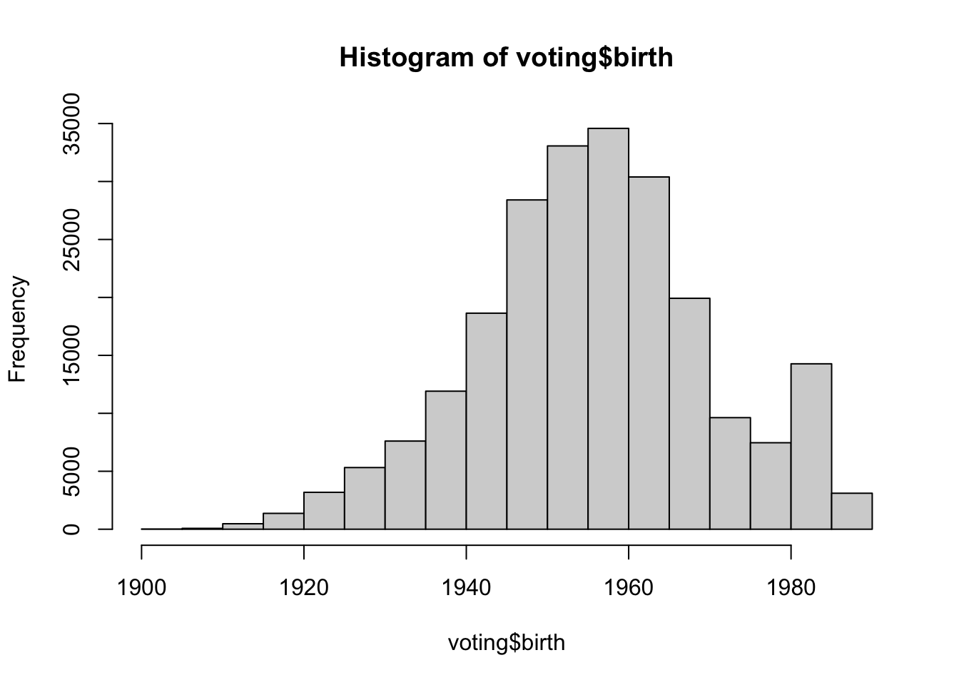
The above histogram provides a distribution of birth years in the sample, segmented into 5-year intervals from 1900 to 1990. For instance, there were 18 individuals born between 1900 and 1904, and 3105 born between 1985 and 1989. The most densely populated interval is between 1950 and 1960. The data suggest a non-uniform distribution, with certain intervals, particularly around the mid-20th century, having notably higher counts of individuals.
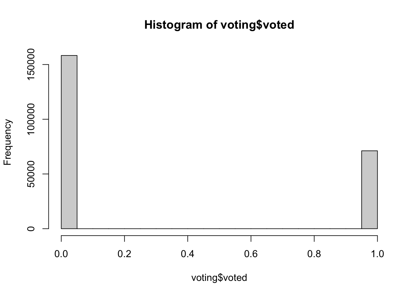
The histogram for the voted variable depicts a binary distribution, as the variable is categorical with levels “0” indicating individuals who did not vote, and “1” representing those who did. As a consequence of the type of the variable, the bins between “0” and “1” have counts of zero. The dataset comprises 158,276 instances of non-voters (“0”) and 71,168 instances of voters (“1”), indicating a substantial disproportion in favor of the non-voters within this sample.
We can also generate histograms using the geom_histogram() function from the ggplot2 package. Additionally, this function allows us to display proportions on the y-axis instead of raw counts. Below, we illustrate this with examples for the birth and voted variables.
In the subsequent two code snippets, the geom_histogram() function is used to create the histogram, wherein the aes(y=..density..) argument displays densities (proportions) rather than raw counts. The fill and color arguments dictate the histogram’s aesthetics, with steelblue for the bars and white for their borders. The bin width specifies the breadth of each bin. The labs() function offers custom labels for the plot’s title and axes, while theme_bw() imparts a clean, white background to the plot.
ggplot(voting, aes(x = birth)) +
  geom_histogram(aes(y = ..density..), fill = "steelblue", color = "white", binwidth = 6) +
  labs(title = "Distribution of Birth Years among Voters in Proportion",
       x = "Birth Year",
       y = "Proportion") +
  theme_bw()
## Warning: The dot-dot notation (`..density..`) was deprecated in ggplot2 3.4.0.
## ℹ Please use `after_stat(density)` instead.
## This warning is displayed once every 8 hours.
## Call `lifecycle::last_lifecycle_warnings()` to see where this warning was
## generated.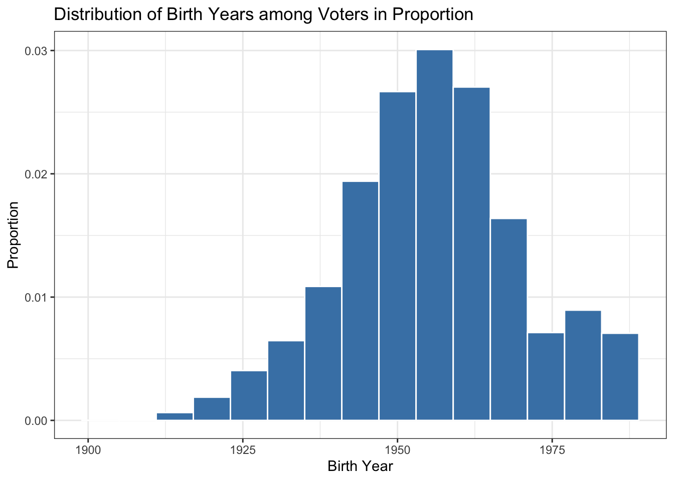
ggplot(voting, aes(x = voted)) +
  geom_histogram(aes(y = ..density..), fill = "steelblue", color = "white", binwidth = 0.5) +
  labs(title = "Distribution of Voting Status",
       x = "Not Voted (0); Voted (1)",
       y = "Proportion") +
  theme_bw()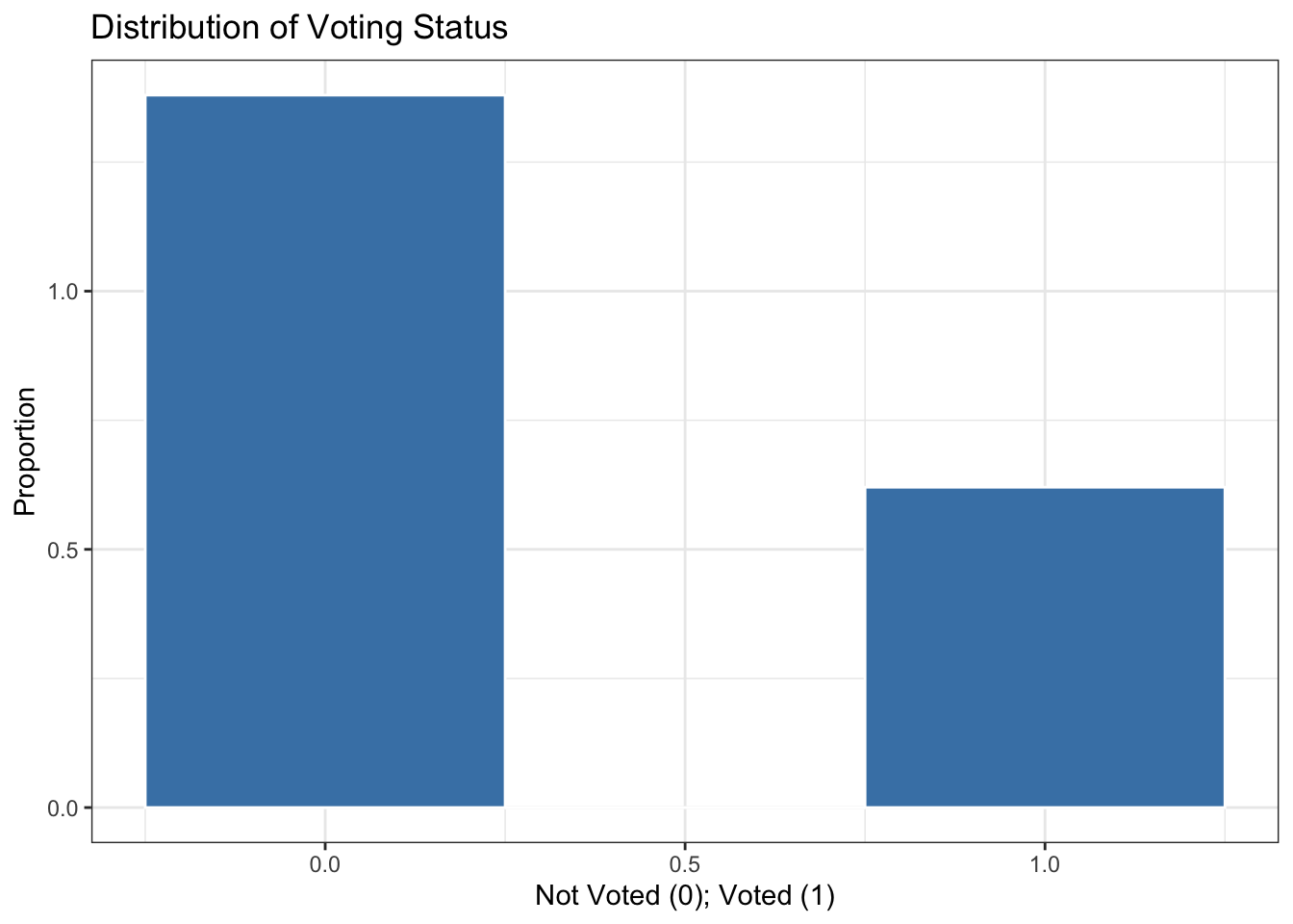
Given that voted is a binary variable, a bar plot would be a more suitable visual representation, reflecting its categorical nature. We can produce a bar plot using geom_bar() in ggplot2. In the code below, by invoking the as.factor() function on the variable voted within the x-axis aesthetic, we inform R that this variable should be treated as categorical. An added advantage of this conversion is that the plot will display only the distinct values present in the dataset, which in this case are 0 and 1. To replace the 0 with “Not Voted” and 1 with “Voted” in the x-axis of your ggplot graph, you can use the scale_x_discrete() function to define custom labels.
ggplot(voting, aes(x = as.factor(voted), y = ..prop.., group = 1)) +
  geom_bar(fill = "steelblue", color = "white") +  # Using geom_bar for categorical data
  labs(title = "Distribution of Voting Status in Proportion",
       x = "Voting Status",
       y = "Proportion") +
  scale_x_discrete(labels = c("Not Voted", "Voted")) +
  theme_bw()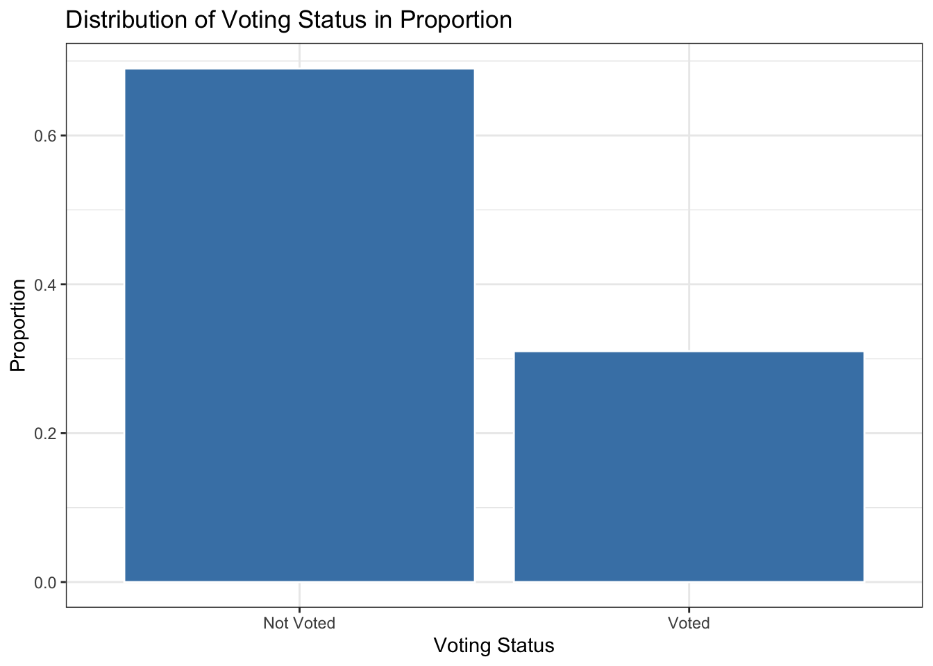
Have you noticed that the distribution of the bins remains the same whether you use counts or proportions? This is to be expected, and here’s why: In a histogram, the bins represent intervals of data values, and their height indicates the number of data points within each bin’s range. Whether represented by counts or proportions, the foundational distribution stays the same; only the scale of the y-axis changes. The data itself dictates the shape of the distribution. When shifting from counts to proportions, we are simply adjusting the height of the bins relative to the total data count, but the comparative relationships between the bins—which capture the essence of the distribution—are preserved.
4.5 STEP 5: Descriptive Statistics
The descriptive statistics of a variable provide a numerical summary of its primary distributional characteristics. Two central aspects to consider are measures of centrality, which determine the center of the distribution and include metrics like the mean and median, and measures of spread, which assess the extent of variation from this center, encompassing the standard deviation and variance.
The figure below depicts differences in centrality and spread metrics.
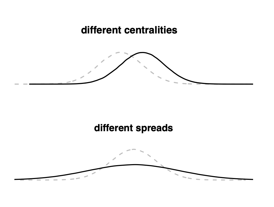
Figure 4.3: Differences in Centrality and Spread Metrics
Differences in centrality refer to the variations in the central values of a data distribution, highlighting where the majority of data points tend to cluster or center. Common measures of centrality include the mean (average) and median (the middle value when data is sorted). For instance, if two datasets have different means, their central tendency is different (see plot different centralities). On the other hand, differences in spreads refer to the extent of variability or dispersion of data points around this central value. Spread metrics, such as the standard deviation and variance, capture the average distance of data points from the center. A larger standard deviation, for example, indicates that data points are spread out over a wider range, while a smaller one means they are closely packed around the central value (see plot different spreads). In essence, while centralities pinpoint where data clusters, spreads quantify how dispersed or concentrated that data is around those central points.
Mean
The mean, often referred to as the average, is one of the most commonly used measures to describe the central tendency of a dataset. When we compute the mean of a set of values, we’re essentially determining a single value that represents the “center” or “balance point” of the data. To calculate the mean, we sum up all the individual values and then divide by the total number of values (observations). This concept is represented by the following formula:
\[ \overline{X} = \frac{\sum_{i=1}^{n} X_i}{n} \]
Where:
- \(X_i\) represents a specific observation of \(X\)
- \(n\) is the total number of observations.
In R, the mean is computed using the mean() function. Let’s look at an example:
Based on the results provided, the mean year of birth for the registered voters in this data set (birth) is approximately 1956. This implies that, on average, registered voters in the data set were born in the year 1956. The mean value for the voted variable is approximately \(0.3102\) or \(31.02\%\). Given the binary nature of this variable where \(1\) denotes a registered voter who voted and \(0\) represents one who did not, a mean of \(0.3102\) suggests that about \(31.02\%\) of the registered voters in the data set voted. Conversely, this implies that the remaining \(68.98\%\) of registered voters did not cast a vote.
It’s essential to recognize that the mean can be influenced by extremely large or small values (e.g., outliers). If a variable contains a few exceptionally high or low numbers, the mean could be pulled in their direction and might not accurately reflect the central tendency of the data. In such cases, other measures of central tendency, such as the median, might be more representative of the data’s center.
Median
The median of a dataset, denoted as \(Med(X)\), is a measure of central tendency that represents the middle value or midpoint when the data is arranged in ascending order. Unlike the mean, which can be influenced by extreme values or outliers, the median is based solely on the order of values, making it particularly useful for non-normally distributed data. The procedure to find the median varies depending on the number of observations, as described in the following formula:
- For an odd number of observations:
\[ Med(X) = X_{\frac{n+1}{2}} \] - For an even number of observations: \[ Med(X) = \frac{X_{\frac{n}{2}} + X_{\frac{n}{2} + 1}}{2} \]
Where \(X_i\) is an observation in the sorted dataset.
In R, the median is computed using the median() function:
Based on the results provided, the median year of birth for the registered voters in this dataset is 1956. This indicates that when sorting all registered voters by their year of birth, the middle value (or the midpoint of the distribution) is the year 1956. In simpler terms, half of the registered voters in the data set were born before 1956, and the other half were born after 1956. The median value for the voted variable is \(0\). Given that the voted variable is binary, where \(1\) indicates a voter who voted and \(0\) represents one who did not vote, a median of \(0\) suggests that at least half of the registered voters in the data set did not vote.
Variance
Variance, often denoted by \(\sigma^2\), quantifies the dispersion or spread of data points within a dataset. It provides insights into how closely or widely the data values are distributed around the mean. A low variance indicates that the values tend to be closely clustered around the mean, while a high variance suggests that the data is spread out over a larger range. The formula to compute the variance of X is,
\[ \sigma^2_X = \frac{\sum_{i=1}^{n} (X_i-\overline{X})^2}{n} \]
Where:
- \(\sigma^2_X\) is the variance of \(X\)
- \(X_i\) represents a specific observation of \(X\)
- \(\overline{X}\) is the mean of \(X\)
- \(n\) is the total number of observations.
In R, the variance is computed using the var() function:
Based on the provided results, the variance for the birth variable is approximately \(209.0971\). This value quantifies the average squared deviation of birth years from their mean. Given that our dataset presumably includes voters from various age groups spanning several generations, this variance offers insight into the spread and diversity of birth years. A higher variance would indicate even greater age diversity, whereas a lower variance would suggest more homogeneity in voters’ ages. In this context, the variance of \(209.0971\) suggests a substantial diversity in the ages of registered voters. Determining the magnitude of variance—whether it’s high or low usually requires some context. Comparing the variance from your dataset to similar datasets, perhaps from different regions or times, can offer some perspective. Additionally, evaluating the range of your data can be revealing. For instance, for a dataset capturing voters’ birth years spanning multiple generations, a certain level of variance might be anticipated. In contrast, if the dataset primarily contained college students, a high variance would be surprising since you’d expect a narrower range of birth years.
The variance of the voted variable is approximately \(0.2139677\). Since voted is a binary variable (0 for ‘didn’t vote’ and 1 for ‘voted’), this variance captures the average squared deviation from the mean voting status. The variance of a binary variable is capped at 0.25, a value reached when both outcomes have a 50% likelihood (i.e., 50% chance for each value). The closer the variance is to 0.25, the more balanced the distribution between the outcomes “voted” and “didn’t vote”. In this context, a variance of \(0.2139677\) indicates variability in voting behaviors among the dataset.
More precisely, the variance \(\sigma^2\) for a binary variable is calculated as: \[ \sigma^2 = p(1-p) \] where \(p\) is the probability of one of the outcomes (let’s say 1 for “voted”).
Given our distribution:
\(p\) for ‘voted’ is 0.31 (31%).
\(1-p\) for ‘didn’t vote’ is 0.69 (69%).
The variance \(\sigma^2\) is: \[ \sigma^2 = 0.31 \times 0.69 = 0.2139 \]
Thus, if 31% voted and 69% didn’t vote, the variance is 0.21. The value of 0.21 indicates that the distribution between “voted” and “didn’t vote” is not perfectly even (which would give a variance of 0.25), reflecting the significant variability in voting behaviors within the sample.
However, while variance can offer insights for binary variables, it might not be the most intuitive metric for understanding their distributions. Often, proportions or percentages are more informative. Additionally, the standard deviation, being on the same scale as the original data, can provide a clearer sense of how individual observations deviate from the mean.
Standard Deviation
Standard deviation, denoted as \(\sigma\), is a key statistical measure that quantifies the dispersion or variability within a dataset. It’s defined as the square root of the variance. By revealing how individual data points differ from the mean, it indicates the spread of values around that central point. A low standard deviation shows that values are closely clustered around the mean, implying limited variability. In contrast, a high value indicates a broader spread, suggesting more variability. Because the standard deviation is expressed in the same units as the data, rather than the squared units of variance, it offers a more intuitive measure of spread.
The formula for calculating the standard deviation of X is,
\[ \sigma_X = \sqrt{\sigma^2_X} \]
Where \(\sigma^2_X\) denotes the variance of variable \(X\).
When calculating the mean and standard deviation (SD) of a variable, these values can help define specific intervals or boundaries. Assuming a normal data distribution, about 68% of data points lie within one standard deviation (1 SD) of the mean. For a mean of 50 and an SD of 10, this translates to roughly 68% of data points falling between 40 and 60. At two standard deviations (2 SD) from the mean, we encompass approximately 95% of the data, or in our example, between 30 and 70. Three standard deviations (3 SD) account for nearly 99.7% of the data, ranging from 20 to 80 in our example. Such intervals shed light on data distribution, facilitate outlier identification, and assist in predictive tasks. For instance, in quality control, if a product’s performance metric falls outside the 2 SD range, it might warrant investigation. In political science, parties are often mapped on an ideological spectrum from left to right. Parties that fall beyond two standard deviations from the center are commonly classified as extremist. Similarly, significant deviations in voter ideological positions can be used to identify the extent of political polarization.
In R, the standard deviation is computed using the sd() function:
The standard deviation for the birth variable is approximately \(14.46\). This suggests that, on average, the birth years of registered voters deviate by about 14.46 years from the mean birth year, which was previously identified as 1956.18. Considering one standard deviation from the mean, we can expect a significant portion of the voters to have birth years between \(1941.72\) (1956.18 - 14.46) and \(1970.64\) (1956.18 + 14.46). Expanding this to two standard deviations, which often encompasses about 95% of the data in a normally distributed set, we would find a range from \(1927.26\) (1956.18 - 2×14.46) to \(1985.10\) (1956.18 + 2×14.46). This range implies that a vast majority of the registered voters in the sample were born between these two years.
The voted variable has a standard deviation of \(0.4626\). For binary variables, a standard deviation of \(0.5\) represents a perfectly even distribution. In this context, the mean vote rate is \(0.3101759\) or approximately 31.02%. One standard deviation from this mean provides a range of \(0.1554\) to \(0.4657\). When considering two standard deviations, the range extends to \(-0.1549\) to \(0.7751\). However, since the variable can only take the values 0 or 1, values outside of this binary set are not meaningful.
As you can see, for binary variables, using measures of dispersion like standard deviation can be mathematically accurate, but their direct interpretation becomes less straightforward. A binary variable is essentially categorical in nature, but it’s been encoded numerically (often as 0 and 1 for computational convenience).
When dealing with binary variables, bear in mind:
- Mean: This quantifies the proportion of “1”s in the dataset, providing a direct insight into the prevalence of one of the binary outcomes. In our example, the data shows that 31.02% of registered voters participated (voted = 1), whereas 68.98% abstained (voted = 0). While not excessively skewed, it underscores that a significant majority of registered voters chose not to vote.
- Standard Deviation: Though calculable, it often lacks intuitive meaning in this context. It suggests the degree of variability in the binary outcomes, but the actual values, such as \(0.16\) or \(0.47\), don’t convey clear, direct interpretations as they would with continuous variables.
Therefore, when interpreting variability in binary variables, consider presenting the distribution of the variable in terms of proportions. Specifically, the mean (or 1 minus the mean) indicates the proportion of ones (or zeros). This metric is typically the most direct and informative. Further, expressing this proportion as a percentage can enhance its intuitive appeal for most audiences.
Also remember: While both variance and standard deviation provide insights into the spread of data, the standard deviation is often more interpretable and intuitive because it’s in the same unit as the data.