Section 6 Measurement
6.1 Measuring Civilian Victimisation during Wartime
Summarize the variables of interest
##       age          educ.years        employed         income
##  Min.   :15.00   Min.   : 0.000   Min.   :0.0000   Length:2754
##  1st Qu.:22.00   1st Qu.: 0.000   1st Qu.:0.0000   Class :character
##  Median :30.00   Median : 1.000   Median :1.0000   Mode  :character
##  Mean   :32.39   Mean   : 4.002   Mean   :0.5828
##  3rd Qu.:40.00   3rd Qu.: 8.000   3rd Qu.:1.0000
##  Max.   :80.00   Max.   :18.000   Max.   :1.0000
Loading data with either data() orread_csv() does not convert strings to factors by default; see below with income.
To get a summary of the different levels, either convert it to a factor (see R4DS Ch 15), or use count():
##            income    n
## 1   10,001-20,000  616
## 2    2,001-10,000 1420
## 3   20,001-30,000   93
## 4 less than 2,000  457
## 5     over 30,000   14
## 6            <NA>  154
Use count to calculate the proportion of respondents who answer that they were harmed by the ISAF or the Taliban (violent.exp.ISAF and violent.exp.taliban, respectively):
afghan %>%
  group_by(violent.exp.ISAF, violent.exp.taliban) %>%
  count() %>%
  ungroup() %>%
  mutate(prop = n / sum(n))
## # A tibble: 9 × 4
## violent.exp.ISAF violent.exp.taliban n prop
## <int> <int> <int> <dbl>
## 1 0 0 1330 0.483
## 2 0 1 354 0.129
## 3 0 NA 22 0.00799
## 4 1 0 475 0.172
## 5 1 1 526 0.191
## 6 1 NA 22 0.00799
## 7 NA 0 7 0.00254
## 8 NA 1 8 0.00290
## 9 NA NA 10 0.00363We need to use ungroup() in order to ensure that sum(n) sums over the entire
dataset as opposed to only within categories of violent.exp.ISAF.
Unlike prop.table(), the code above does not drop missing values.
We can drop those values by adding filter() and !is.na() to test
for missing values in those variables:
afghan %>%
  filter(!is.na(violent.exp.ISAF), !is.na(violent.exp.taliban)) %>%
  group_by(violent.exp.ISAF, violent.exp.taliban) %>%
  count() %>%
  ungroup() %>%
  mutate(prop = n / sum(n))
## # A tibble: 4 × 4
## violent.exp.ISAF violent.exp.taliban n prop
## <int> <int> <int> <dbl>
## 1 0 0 1330 0.495
## 2 0 1 354 0.132
## 3 1 0 475 0.177
## 4 1 1 526 0.1966.2 Handling Missing Data in R
We already observed the issues with NA values in calculating the proportion
answering the “experienced violence” questions.
You can filter rows with specific variables having missing values using filter()
as shown above.
##  [1] "2,001-10,000"  "2,001-10,000"  "2,001-10,000"  "2,001-10,000"
##  [5] "2,001-10,000"  NA              "10,001-20,000" "2,001-10,000"
## [9] "2,001-10,000" NA## [1] FALSE FALSE FALSE FALSE FALSE TRUE FALSE FALSE FALSE TRUECounts and proportion of missing values of income:
##   n_missing  p_missing
## 1       154 0.05591866
Mean, and other functions, do not by default exclude missing values. Use na.rm = TRUE in these cases. By the way, na.rm stands for “remove missing values.”
## [1] NA## [1] 2Table of proportions of individuals harmed by the ISAF and Taliban that includes missing (NA) values:
violent_exp_prop <-
  afghan %>%
  group_by(violent.exp.ISAF, violent.exp.taliban) %>%
  count() %>%
  ungroup() %>%
  mutate(prop = n / sum(n)) %>%
  select(-n) # remove the column named "n" (count) from the resulting data frame
violent_exp_prop
## # A tibble: 9 × 3
## violent.exp.ISAF violent.exp.taliban prop
## <int> <int> <dbl>
## 1 0 0 0.483
## 2 0 1 0.129
## 3 0 NA 0.00799
## 4 1 0 0.172
## 5 1 1 0.191
## 6 1 NA 0.00799
## 7 NA 0 0.00254
## 8 NA 1 0.00290
## 9 NA NA 0.00363The data frame above can be reorganized so that rows are ISAF and the columns are Taliban as follows:
## # A tibble: 3 × 4
##   violent.exp.ISAF     `0`     `1`  `<NA>`
##              <int>   <dbl>   <dbl>   <dbl>
## 1                0 0.483   0.129   0.00799
## 2                1 0.172   0.191   0.00799
## 3               NA 0.00254 0.00290 0.00363
The function drop_na() is an alternative that allows for removing missing values,
Tip There are multiple types of missing values.
## [1] NA## [1] NA## [1] NA## [1] NAIn many cases, these distinctions do not matter since many functions will coerce these missing values to the correct vector type.
## [1] "integer"## [1] 1 2 NA NA NAHowever, if you encounter an error, you will have to specify NA_integer_ instead:
## [1] 1 2 NA NA NA6.3 Visualizing the Univariate Distribution
6.3.1 Barplot
The code to create a bar plot below is using functions from the forcats package in tidyverse, which is used for working with factors (categorical variables). Let’s break down what these functions do:
factor(violent.exp.ISAF): This part converts the variableviolent.exp.ISAFinto a factor. Factors are used to represent categorical variables in R, where each level of the variable is treated as a distinct category.fct_recode(...): This function is used to recode the levels of a factor. In the context of the code below, it’s modifying the levels of the factor created fromviolent.exp.ISAF."Harm" = "1": This part specifies that the level “1” should be recoded as “Harm.”"No Harm" = "0": This part specifies that the level “0” should be recoded as “No Harm.”
fct_na_value_to_level("No response"): This function is used to handle missing values (NA) within a factor. It replaces NA values with a specified level, in this case, “No response.” This ensures that missing values in theviolent.exp.ISAFvariable are explicitly labeled.
In sum, it takes the original factor of violent.exp.ISAF, recodes its levels “1” and “0” to “Harm” and “No Harm” respectively, and then replaces any missing values with the level “No response.” The result of this expression is a modified factor that can be used in further analyses or visualization.
afghan <- afghan %>%
  mutate(violent.exp.ISAF.fct =
           fct_recode(factor(violent.exp.ISAF),
                      "Harm" = "1", "No Harm" = "0") %>%
           fct_na_value_to_level("No response"))


ggplot(afghan, aes(x = violent.exp.ISAF.fct, y = after_stat(prop), group = 1)) +
  geom_bar() +
  xlab("Response category") +
  ylab("Proportion of respondents") +
  ggtitle("Civilian Victimisation by the ISAF") +
  theme_few()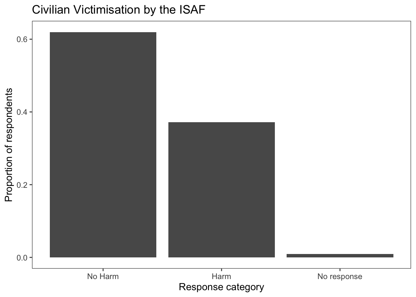
afghan <-
  afghan %>%
  mutate(violent.exp.taliban.fct =
           fct_recode(factor(violent.exp.taliban),
                      "Harm" = "1", "No Harm" = "0") %>%
           fct_na_value_to_level("No response"))

ggplot(afghan, aes(x = violent.exp.taliban.fct, y = after_stat(prop), group = 1)) +
  geom_bar() +
  xlab("Response category") +
  ylab("Proportion of respondents") +
  ggtitle("Civilian Victimisation by the Taliban") +
  theme_few()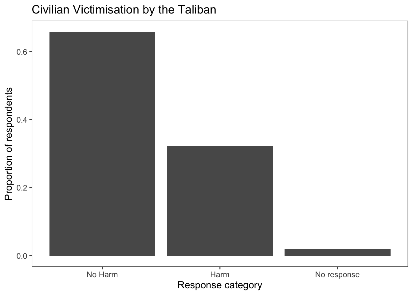
Instead of creating two separate box plots, create a single plot faceted by ISAF and Taliban:
afghan %>%
  select(violent.exp.ISAF, violent.exp.taliban) %>%
  gather(variable, value) %>%
  mutate(value = fct_recode(factor(value),
                             "Harm" = "1", "No Harm" = "0") %>%
           fct_na_value_to_level("No response"),
         variable = recode(variable,
                           "violent.exp.ISAF" = "ISAF",
                           "violent.exp.taliban" = "Taliban")) %>%
  ggplot(aes(x = value, y = after_stat(prop), group = 1)) +
  geom_bar() +
  facet_wrap(~ variable, ncol = 1) +
  xlab("Response category") +
  ylab("Proportion of respondents") +
  ggtitle("Civilian Victimisation") +
  theme_few()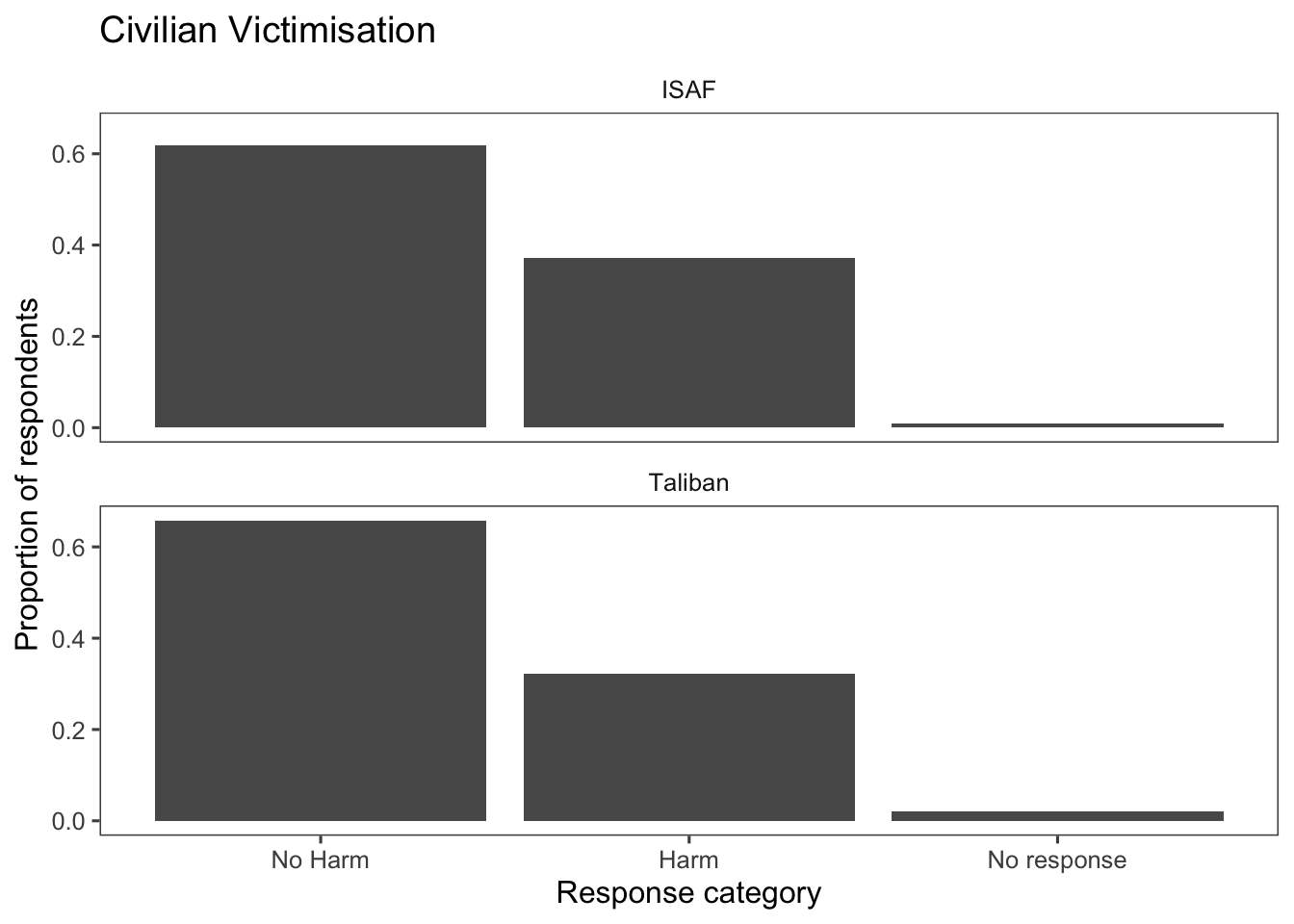
6.3.2 Histogram
See the documentation for geom_histogram().
Creating a histogram using the variable age from the data set afghan. In the code below, the line scale_x_continuous(breaks = seq(20, 80, by = 10)) is used to customize the x-axis of the plot. Let’s break down what each part does:
scale_x_continuous(): This function is used to customize the scaling and appearance of the x-axis, assuming the data on the x-axis is continuous (or numeric).breaks = seq(20, 80, by = 10): This argument specifies where tick marks (breaks) should be placed on the x-axis. In this case, it generates a sequence of numbers from 20 to 80 with an interval of 10. This means tick marks will appear at 20, 30, 40, 50, 60, 70, and 80 on the x-axis.
When you create a histogram or density plot using ggplot2, the process involves calculating the density of data points in each bin of the histogram. The density represents the number of data points per unit of the variable being plotted. When you use after_stat(density) in your ggplot code, it refers to the calculated density values for the bins. This allows you to use the density values in various parts of your plot, including in labels (in the case below, for the label of the y-axis).
ggplot(afghan, aes(x = age, y = after_stat(density))) +
  geom_histogram(binwidth = 5, boundary = 0) +
  scale_x_continuous(breaks = seq(20, 80, by = 10)) +
  labs(title = "Distribution of respondent's age",
       y = "Age", x = "Density") +
  theme_few()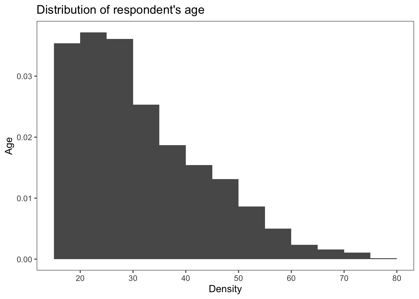
We can improve our graph adding more information. The code below adds a vertical line and an annotation to a ggplot2 plot. Let’s break down each part:
geom_vline(xintercept = median(afghan$educ.years), color = "red", linewidth = 1): This line adds a vertical line to the plot usinggeom_vline().xinterceptspecifies where the vertical line should be placed, and it’s set to the median value of the educ.years column in the afghan data frame.colorsets the color of the line to red.linewidthdetermines the width of the line, set to 1.
annotate("text", x = median(afghan$educ.years), y = 0.2, label = "median", hjust = 0): This line adds an annotation to the plot usingannotate()."text"specifies that a text annotation should be added.xspecifies the x-coordinate of the annotation, set to the median value of the educ.years column.yspecifies the y-coordinate of the annotation, set to 0.2.labelsets the text label of the annotation to “median”.hjustspecifies the horizontal justification of the text, set to 0 to align the text to the left.
Together, these lines of code add a vertical line at the median value of the educ.years column and annotate it with the label “median” placed at a specific y-coordinate. This can be useful to highlight important summary points or statistics on the plot.
ggplot(afghan, aes(x = educ.years, y = ..density..)) +
  geom_histogram(binwidth = 1, center = 0) +
  geom_vline(xintercept = median(afghan$educ.years),
             color = "red", linewidth = 1) +
  annotate("text", x = median(afghan$educ.years),
           y = 0.2, label = "median", hjust = 0) +
  labs(title = "Distribution of respondent's education",
       x = "Years of education",
       y = "Density") +
  theme_few()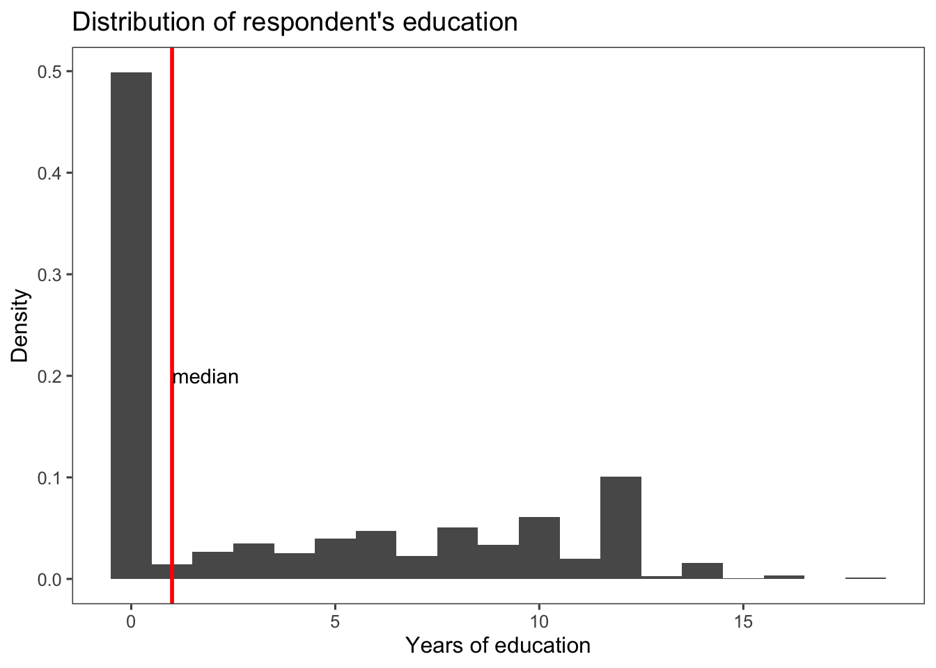
Below, I provide some alternatives to histogram.
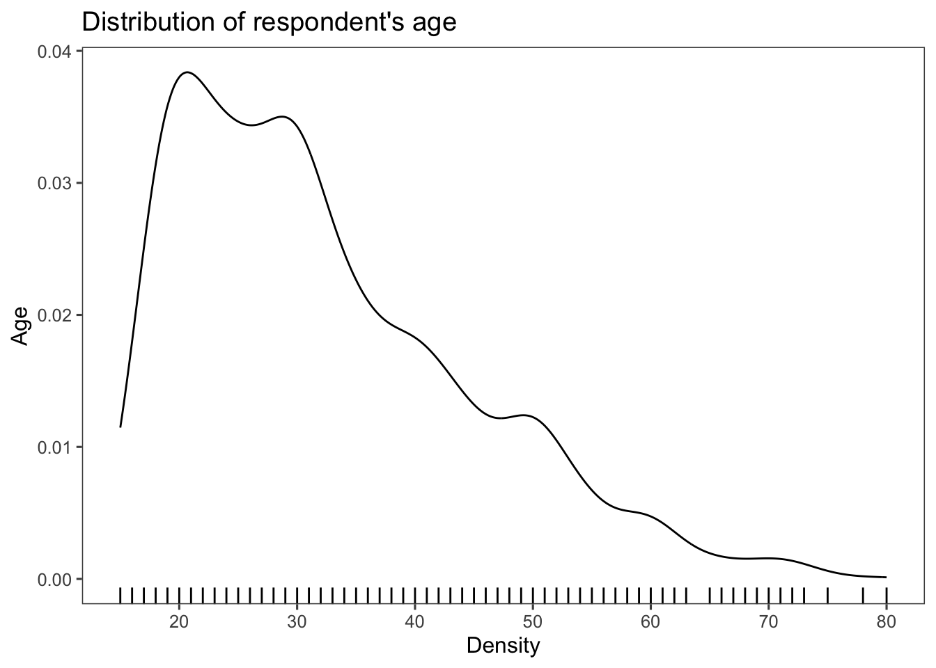
Kernel density plots using the geom_density() function:
dens_plot <- ggplot(afghan, aes(x = age)) +
  geom_density() +
  scale_x_continuous(breaks = seq(20, 80, by = 10)) +
  labs(title = "Distribution of respondent's age",
       y = "Age", x = "Density") +
  theme_few()

dens_plot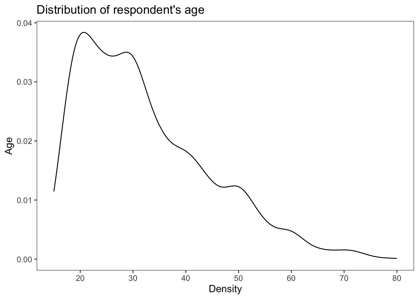
which can be combined with a geom_rug() to create a rug
plot, which adds small vertical lines or tick marks that extend along an axis to show the distribution of individual data points. More rug marks in a specific area (darker rugs) suggest that more data points are clustered around that value.
Frequency polygons using the function geom_freqpoly():
ggplot(afghan, aes(x = age)) +
  geom_freqpoly() +
  scale_x_continuous(breaks = seq(20, 80, by = 10)) +
  labs(title = "Distribution of respondent's age",
       y = "Age", x = "Density") +
  theme_few()
## `stat_bin()` using `bins = 30`. Pick better value with `binwidth`.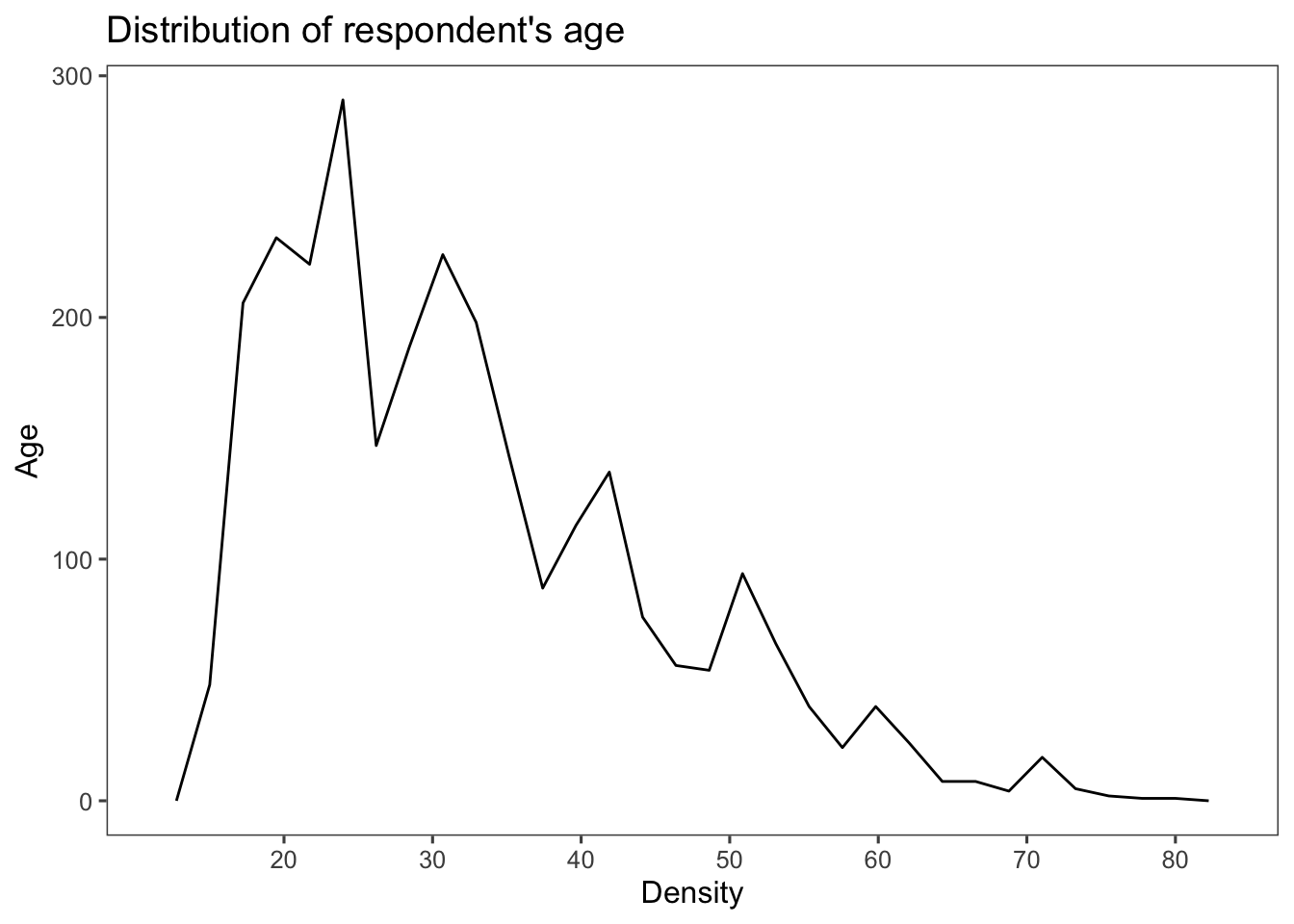
6.3.3 Box plot
See the documentation for geom_boxplot().
The code below produces a horizontal box plot of the age variable from the afghan data set. Even though the y aesthetic is assigned to age (aes(y = age)), the use of coord_flip() flips the coordinates, making age appear on the x-axis. This results in a clear representation of the distribution of ages. (Try removing coord_flip() + line from the code to see what happens.)
ggplot(afghan, aes(y = age)) +
  geom_boxplot() +
  coord_flip() + #  to flip the coordinates of a plot; particularly useful when you want to create horizontal versions of plots
  labs(y = "Age", x = "", title = "Distribution of Age") +
  theme_few()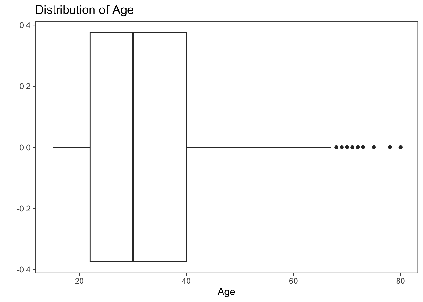
Let’s also create box plots of the educ.years variable against the province variable. The x-axis now represents different provinces, and the y-axis represents the years of education.
ggplot(afghan, aes(y = educ.years, x = province)) +
  geom_boxplot() +
  coord_flip() +
  labs(x = "Province", y = "Years of education",
       title = "Education by Province") +
  theme_few()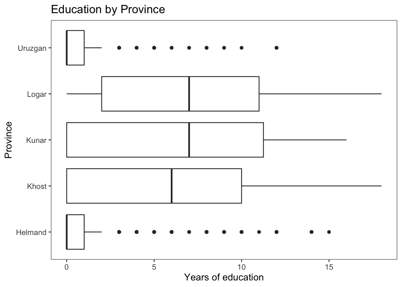
From the box plot created, we can see that Helmand and Uruzgan have much lower levels of education than the other provinces, and also report higher levels of violence (see the code below to extract this information).
afghan %>%
  group_by(province) %>%
  summarise(educ.years = mean(educ.years, na.rm = TRUE),
            violent.exp.taliban =
              mean(violent.exp.taliban, na.rm = TRUE),
            violent.exp.ISAF =
              mean(violent.exp.ISAF, na.rm = TRUE)) %>%
  arrange(educ.years)
## # A tibble: 5 × 4
## province educ.years violent.exp.taliban violent.exp.ISAF
## <chr> <dbl> <dbl> <dbl>
## 1 Uruzgan 1.04 0.455 0.496
## 2 Helmand 1.60 0.504 0.541
## 3 Khost 5.79 0.233 0.242
## 4 Kunar 5.93 0.303 0.399
## 5 Logar 6.70 0.0802 0.144Alternatives to the traditional boxplot:
Dot plot using the geom_point() function with jitter and adjusted alpha. Let’s break down what each part of the code does:
geom_point(...): This function is used to add individual points to a plot, typically for dot plots, scatter plots or other point-based visualizations.position = position_jitter(width = 0.25, height = 0): This part customizes the positioning of the points. It uses theposition_jitter()function to add a small amount of random jitter to the x and y coordinates of the points. Adding a small amount of random jitter to the x and y coordinates of points in a plot prevents points from overlapping, which would otherwise result in multiple points stacking on top of each other and potentially obscuring the data’s distribution and patterns.width = 0.25: This sets the width of the jitter for the x-coordinate to 0.25 units. This means each point’s x-coordinate will be slightly shifted within the range of +/- 0.25 units.height = 0: This sets the height of the jitter for the y-coordinate to 0 units, meaning there will be no vertical jitter applied.
alpha = 0.2: This sets the transparency level of the points to 0.2, making them slightly transparent. This can be useful when you have overlapping points, as it helps reveal the density of points in crowded areas.
ggplot(afghan, aes(y = educ.years, x = province)) +
  geom_point(position = position_jitter(width = 0.25, height = 0),
             alpha = .2) +
  coord_flip() +
  labs(x = "Province", y = "Years of education",
       title = "Education by Province") +
  theme_few()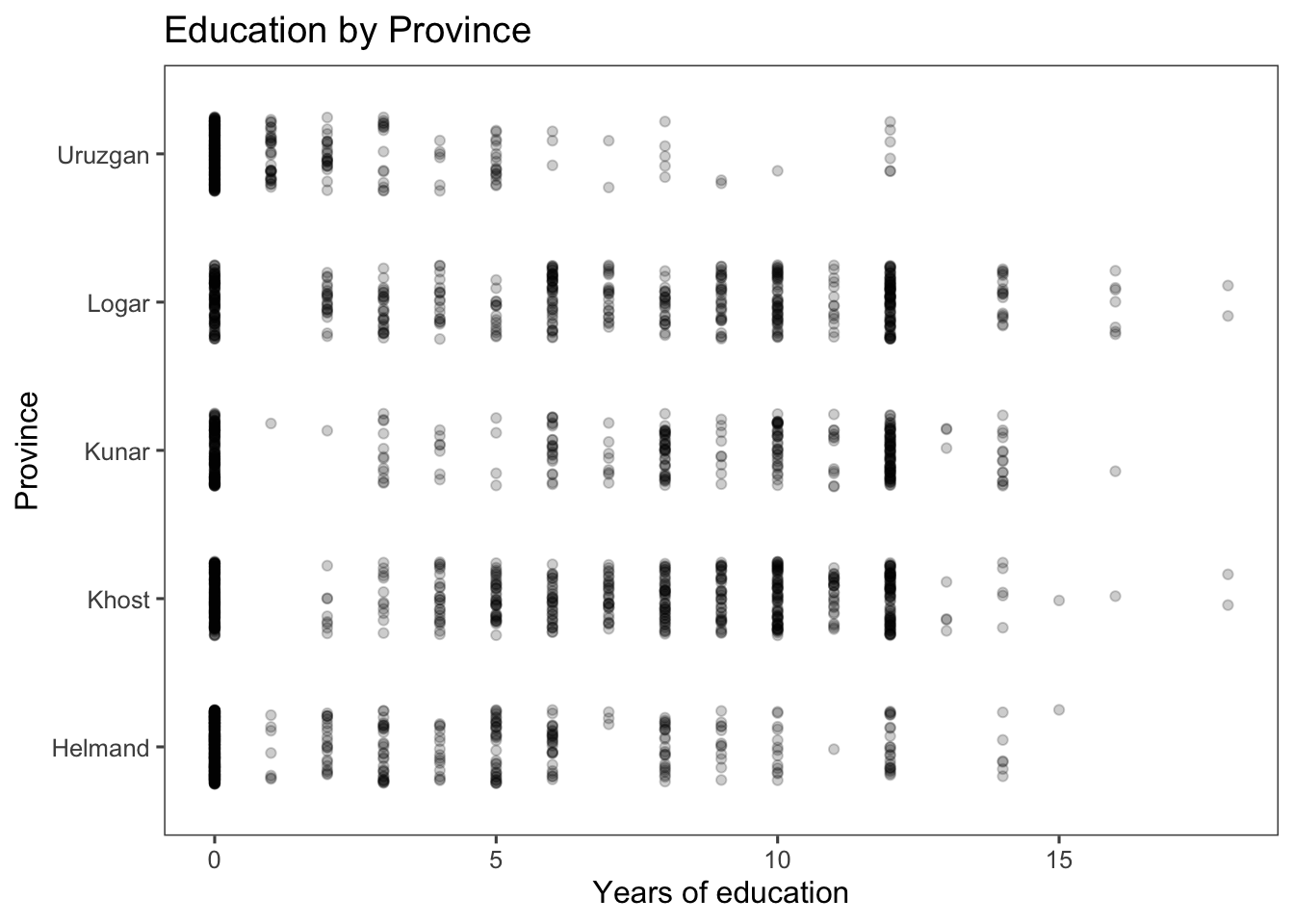
A violin plot using the geom_flip() function:
ggplot(afghan, aes(y = educ.years, x = province)) +
  geom_violin() +
  coord_flip() +
  labs(x = "Province", y = "Years of education",
       title = "Education by Province") +
  theme_few()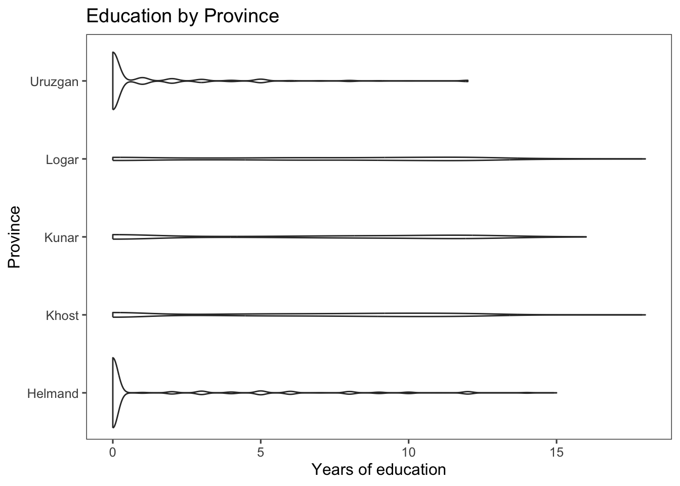
6.3.4 Printing and saving graphics
You can use the ggsave() function within ggplot2 to save your visualizations as graphics files in your current working directory.
The frequently used parameters of the ggsave() function include:
filename: Specifies the name of the file to save the plot. This should include the file extension (e.g., “.png”, “.jpg”).
plot: Specifies the ggplot object you want to save. You can use
last_plot()to refer to the most recently created plot.width and height: Specify the width and height of the output plot in inches.
dpi: Specifies the resolution in dots per inch (DPI) for bitmap formats (like PNG or JPEG).
Here’s an example:
# Example: Save the last plot as a PNG file
ggsave(filename = "~/Downloads/my_plot.png", plot = last_plot(), width = 6, height = 4, dpi = 700)

# Note: Remember to change the working directory if needed
# to ensure the file is saved in your desired location.
For more details, run ?ggsave.
6.4 Survey Sampling
6.4.1 The Role of Randomization
The code below creates a box plot for altitude (in meters) using data from the afghan.village dataset. Let’s break down the first part of the code:
x = factor(village.surveyed, labels = c("sampled", "non-sampled")): Sets the x-axis aesthetic to the village.surveyed variable after converting it to a factor. Thelabelsargument is used to provide new labels for the factor levels, in this case “sampled” for the top plot and “non-sampled” for the bottom plot.y = altitude: Sets the y-axis aesthetic to the “altitude” variable.
ggplot(afghan.village, aes(x = factor(village.surveyed,
                                      labels = c("sampled", "non-sampled")),
                           y = altitude)) +
  geom_boxplot() +
  labs(y = "Altitude (meter)", x = "") +
  coord_flip() +
  theme_few()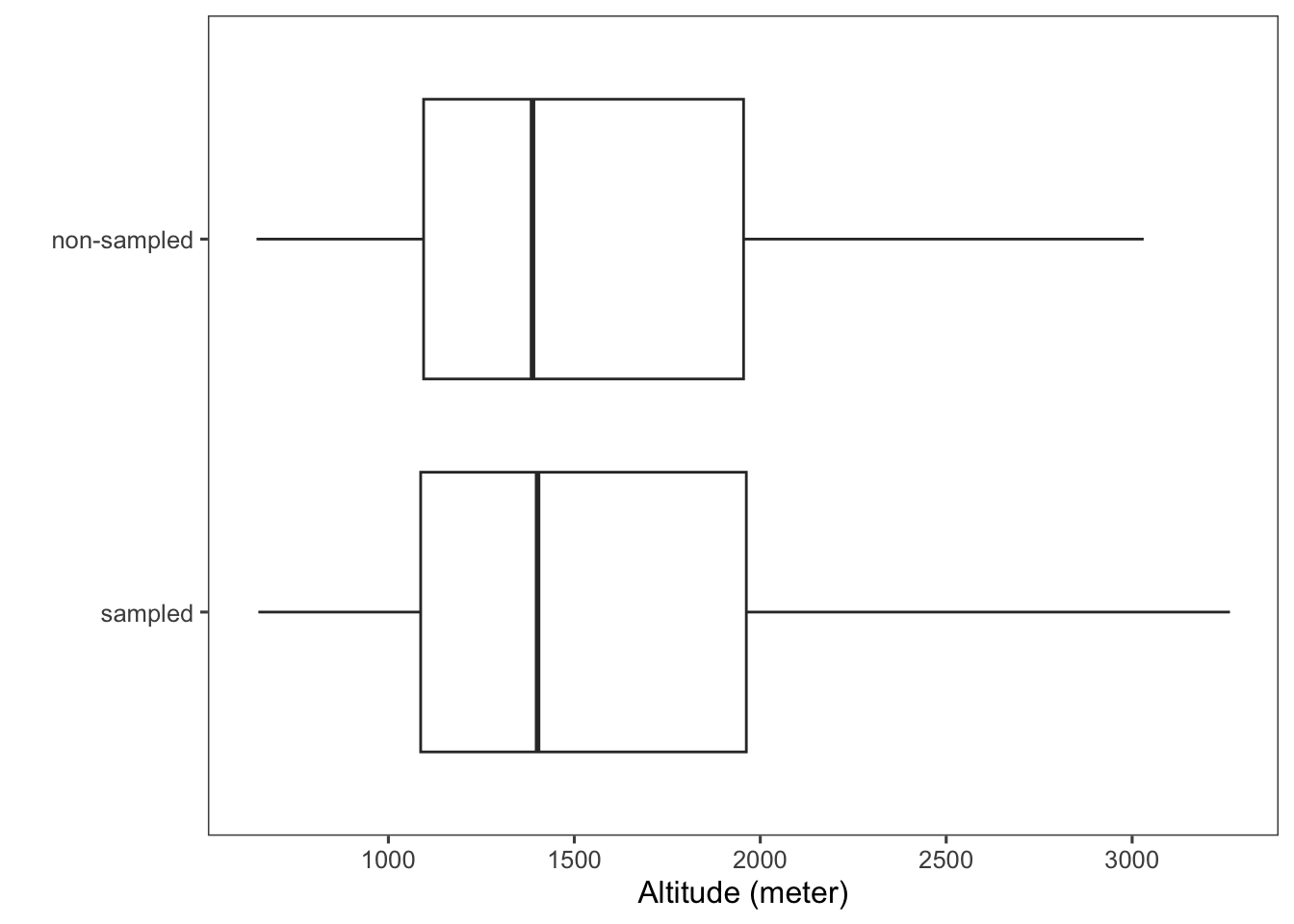
Box plots log-population values of sampled and non-sampled. Using log(population) instead of raw population values can compress the range of data, making visualization easier and addressing issues related to data scale and distribution. This is particularly helpful when dealing with skewed data (i.e., asymmetrical data distribution in which the values are not evenly spread out around the mean).
ggplot(afghan.village, aes(x = factor(village.surveyed,
                                      labels = c("sampled", "non-sampled")),
                           y = log(population))) +
  geom_boxplot() +
  labs(y = "log(population)", x = "") +
  coord_flip() +
  theme_few()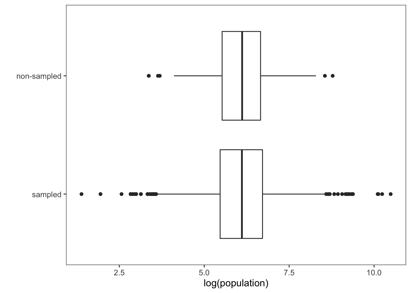
You can also compare these distributions by plotting their densities using the geom_density() function. Note that below we are adding the rugs again with the geom_rug() function.
ggplot(afghan.village, aes(colour = factor(village.surveyed,
                                      labels = c("sampled", "non-sampled")),
                           x = log(population))) +
  geom_density() +
  geom_rug() +
  labs(x = "log(population)", colour = "") +
  theme_few()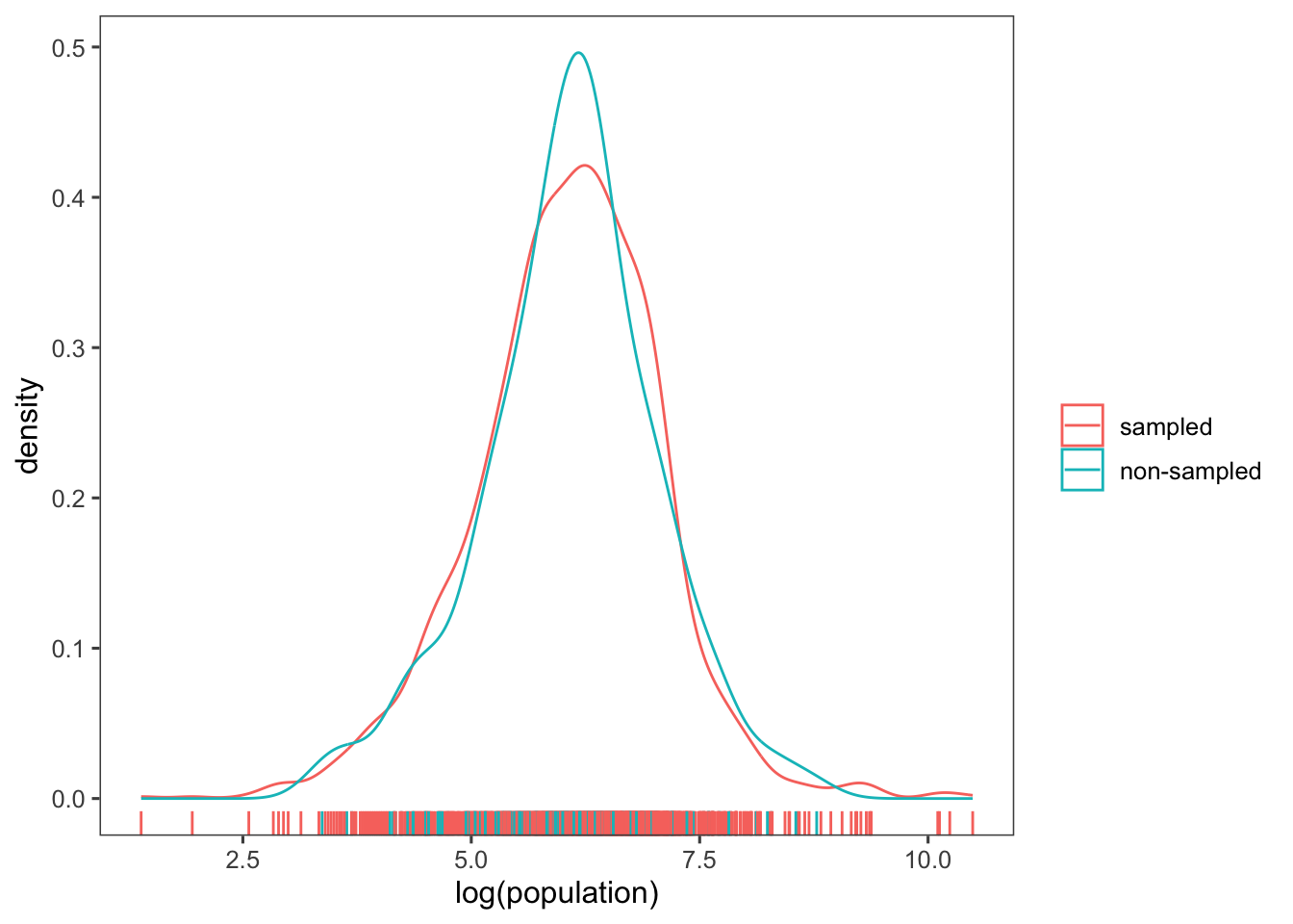
6.4.2 Non-response and other sources of bias
Calculate the rates of item non-response by province to the question about civilian victimisation by ISAF and Taliban forces (violent.exp.ISAF and
violent.exp.taliban):
afghan %>%
  group_by(province) %>%
  summarise(ISAF = mean(is.na(violent.exp.ISAF)),
            taliban = mean(is.na(violent.exp.taliban))) %>%
  arrange(-ISAF) # arranges the rows of the summarized data frame in descending order based on the values in the "ISAF" column
## # A tibble: 5 × 3
## province ISAF taliban
## <chr> <dbl> <dbl>
## 1 Uruzgan 0.0207 0.0620
## 2 Helmand 0.0164 0.0304
## 3 Khost 0.00476 0.00635
## 4 Kunar 0 0
## 5 Logar 0 0Calculate the proportion who support the ISAF using the difference in means between the ISAF and control groups:
(mean(filter(afghan, list.group == "ISAF")$list.response) -
  mean(filter(afghan, list.group == "control")$list.response))
## [1] 0.04901961To calculate the table responses to the list experiment in the control, ISAF, and Taliban groups:
afghan %>%
  group_by(list.response, list.group) %>%
  count() %>%
  glimpse() %>%
  spread(list.group, n, fill = 0)
## Rows: 12
## Columns: 3
## Groups: list.response, list.group [12]
## $ list.response <int> 0, 0, 1, 1, 1, 2, 2, 2, 3, 3, 3, 4
## $ list.group <chr> "ISAF", "control", "ISAF", "control", "taliban", "ISAF",…
## $ n <int> 174, 188, 278, 265, 433, 260, 265, 287, 182, 200, 198, 24## # A tibble: 5 × 4
## # Groups: list.response [5]
## list.response control ISAF taliban
## <int> <dbl> <dbl> <dbl>
## 1 0 188 174 0
## 2 1 265 278 433
## 3 2 265 260 287
## 4 3 200 182 198
## 5 4 0 24 06.5 Measuring Political Polarization
## Rows: 14,552
## Columns: 7
## $ congress <int> 80, 80, 80, 80, 80, 80, 80, 80, 80, 80, 80, 80, 80, 80, 80, 8…
## $ district <int> 0, 1, 2, 3, 4, 5, 6, 7, 8, 9, 98, 98, 1, 2, 3, 4, 5, 6, 7, 1,…
## $ state    <chr> "USA", "ALABAMA", "ALABAMA", "ALABAMA", "ALABAMA", "ALABAMA",…
## $ party    <chr> "Democrat", "Democrat", "Democrat", "Democrat", "Democrat", "…
## $ name     <chr> "TRUMAN", "BOYKIN  F.", "GRANT  G.", "ANDREWS  G.", "HOBBS  S…
## $ dwnom1   <dbl> -0.276, -0.026, -0.042, -0.008, -0.082, -0.170, -0.124, -0.03…
## $ dwnom2   <dbl> 0.016, 0.796, 0.999, 1.005, 1.066, 0.870, 0.990, 0.892, 0.888…
The code below creates a scatter plot comparing political positions based on “racial liberalism/conservatism” and “economic liberalism/conservatism” for specific congress sessions (80 and 112) and political parties (US Democrat and US Republican). Here’s an explanation of the lines of the code that might be new to you:
filter(congress %in% c(80, 112), party %in% c("Democrat", "Republican")) %>%: Filters the data to include only rows where the “congress” column contains values 80 or 112 and the “party” column contains either “Democrat” or “Republican”. The U.S. Congress is the legislative branch of the U.S. federal government, and each session represents a two-year period during which laws are considered and passed. For instance, Congress 80 typically refers to the 80th session of the U.S. Congress, and so on.ggplot(aes(x = dwnom1, y = dwnom2, colour = party)): Initializes a ggplot object with aesthetics mapping, where “dwnom1” and “dwnom2” are mapped to the x and y axes, and “party” determines the color of the points.facet_wrap(~ congress): Organizes the plot into facets (subplots) based on the “congress” variable.coord_fixed(): Adjusts the aspect ratio to ensure equal scaling along both axes. This is particularly helpful when plotting data where equal scaling along both axes is necessary for accurate representation and comparison. It’s often used to prevent distortion, especially when the units on the x and y axes are different.scale_y_continuous("racial liberalism/conservatism", limits = c(-1.5, 1.5)): Sets the y-axis label and limits its range to -1.5 to 1.5.scale_x_continuous("economic liberalism/conservatism", limits = c(-1.5, 1.5)): Sets the x-axis label and limits its range to -1.5 to 1.5.
pol_plot <-
  congress %>%
  filter(congress %in% c(80, 112),
         party %in% c("Democrat", "Republican")) %>%
  ggplot(aes(x = dwnom1, y = dwnom2, colour = party)) +
  geom_point() +
  facet_wrap(~ congress) +
  coord_fixed() +
  scale_y_continuous("racial liberalism/conservatism",
                     limits = c(-1.5, 1.5)) +
  scale_x_continuous("economic liberalism/conservatism",
                     limits = c(-1.5, 1.5)) +
  theme_few()
pol_plot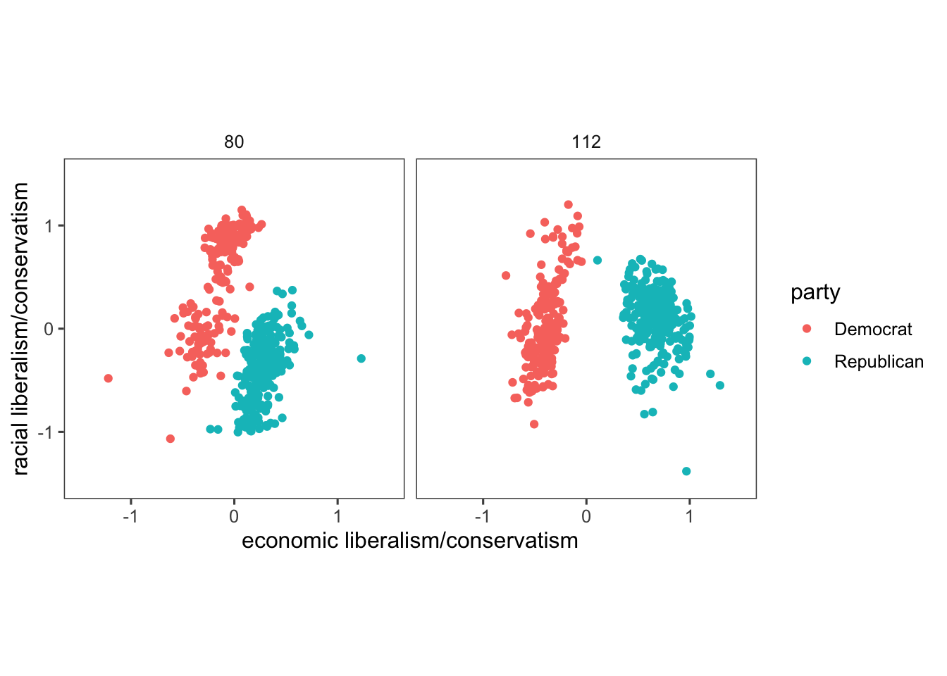
However, since there are colors associated with Democrats (blue) and Republicans (blue), we should use them rather than the R defaults. There’s some evidence that using semantically-resonant colors can help decoding data visualizations (See Lin, et al. 2013). Since we might reuse the scale later, let’s save it in a variable and later adds the custom color scale to the created plot pol_plot. In more details,
scale_colour_parties <- scale_colour_manual(values = c(...)): Creates a custom color scale named “scale_colour_parties” using thescale_colour_manual()function. It assigns specific colors to each party category:- “Democrat” is assigned the color “blue”.
- “Republican” is assigned the color “red”.
- “Other” is assigned the color “purple”.
pol_plot + scale_colour_parties: Adds the custom color scale “scale_colour_parties” to the existing plot “pol_plot”. This customises the colors of the points in the plot we created without the need to run all the previous code again. This works only because we assigned a name to our graph object (pol_plot <-) before the ggplot code.
scale_colour_parties <-
  scale_colour_manual(values = c(Democrat = "blue",
                                 Republican = "red",
                                 Other = "purple"))
pol_plot + scale_colour_parties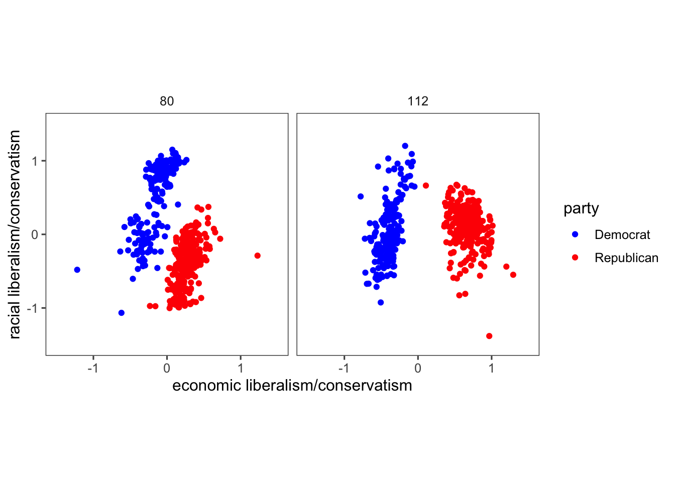
Remember that when we created pol_plot, we filtered the data to include only rows where the “congress” column contains values 80 or 112. Look what happens to our plot when we don’t filter the data:
congress %>%
  ggplot(aes(x = dwnom1, y = dwnom2, colour = party)) +
  geom_point() +
  facet_wrap(~ congress) +
  coord_fixed() +
  scale_y_continuous("racial liberalism/conservatism",
                     limits = c(-2, 2)) +
  scale_x_continuous("economic liberalism/conservatism",
                     limits = c(-2, 2)) +
  theme_few() +
  scale_colour_parties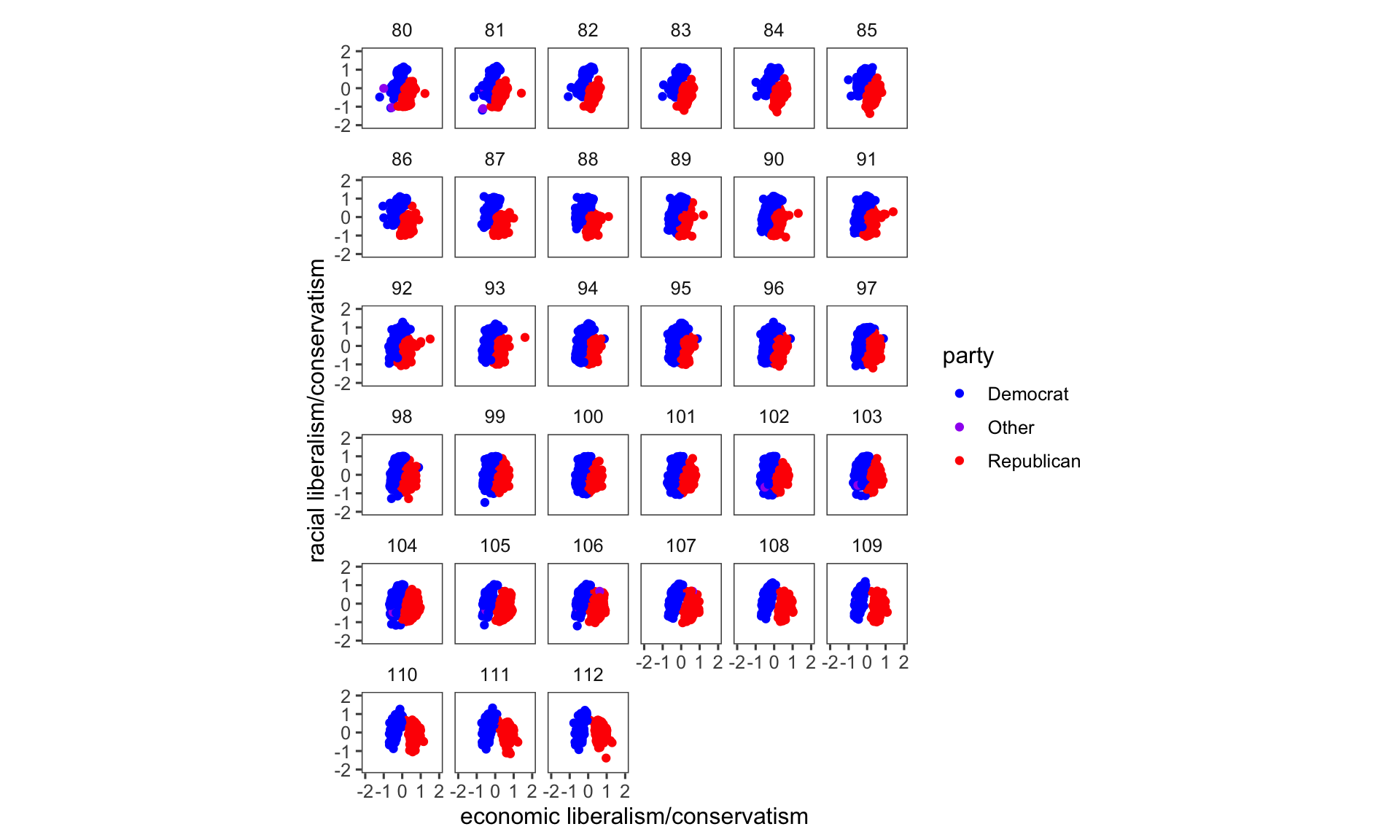
We can also produce a line plot using the geom_line() function. In this case, we will filter by party but not by congress using filter(party %in% c("Democrat", "Republican")). The code fct_reorder2() reorders the factor by the y values associated with the largest x values. This makes the plot easier to read because the line colours line up with the legend.
congress %>%
  group_by(congress, party) %>%
  summarise(dwnom1 = mean(dwnom1)) %>%
  filter(party %in% c("Democrat", "Republican")) %>%
  ggplot(aes(x = congress, y = dwnom1,
             colour = fct_reorder2(party, congress, dwnom1))) +
  geom_line() +
  scale_colour_parties +
  labs(y = "DW-NOMINATE score (1st Dimension)", x = "Congress",
       colour = "Party") +
  theme_few()
## `summarise()` has grouped output by 'congress'. You can override using the
## `.groups` argument.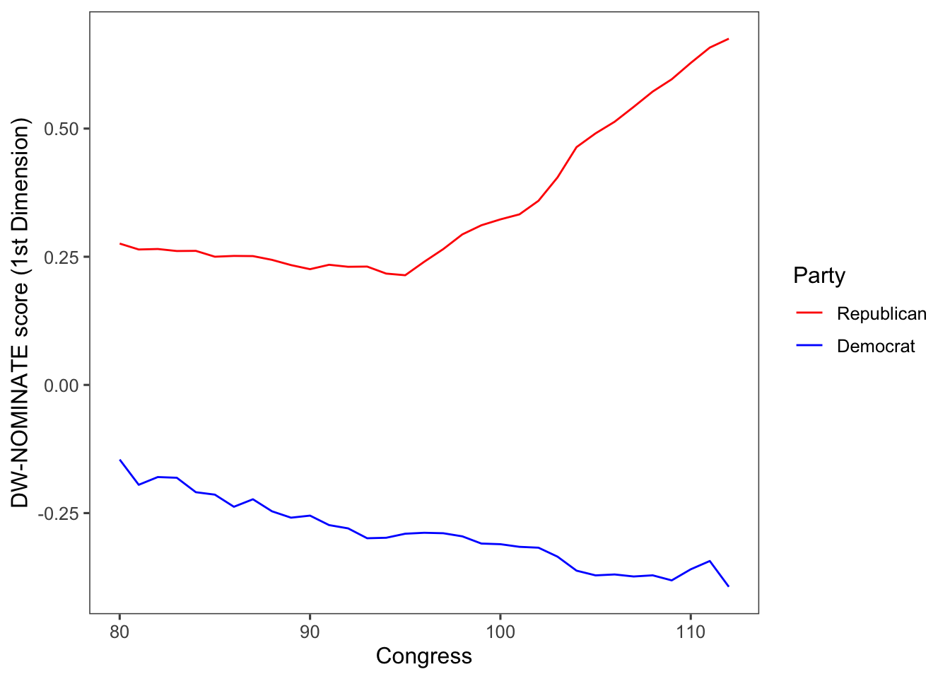
To calculate a measure of party polarization take the code used in the plot of Republican and Democratic party median ideal points and adapt it to calculate the difference in the party medians:
party_polarization <-
  congress %>%
  group_by(congress, party) %>%
  summarise(dwnom1 = mean(dwnom1)) %>%
  filter(party %in% c("Democrat", "Republican")) %>%
  spread(party, dwnom1) %>%
  mutate(polarization = Republican - Democrat)
## `summarise()` has grouped output by 'congress'. You can override using the
## `.groups` argument.## # A tibble: 33 × 4
## # Groups: congress [33]
## congress Democrat Republican polarization
## <int> <dbl> <dbl> <dbl>
## 1 80 -0.146 0.276 0.421
## 2 81 -0.195 0.264 0.459
## 3 82 -0.180 0.265 0.445
## 4 83 -0.181 0.261 0.442
## 5 84 -0.209 0.261 0.471
## 6 85 -0.214 0.250 0.464
## 7 86 -0.238 0.252 0.489
## 8 87 -0.223 0.251 0.474
## 9 88 -0.246 0.244 0.490
## 10 89 -0.259 0.234 0.493
## # ℹ 23 more rowsggplot(party_polarization, aes(x = congress, y = polarization)) +
geom_point() +
geom_line() +
ggtitle("Political Polarization") +
labs(x = "Year", y = "Republican median − Democratic median") +
theme_few()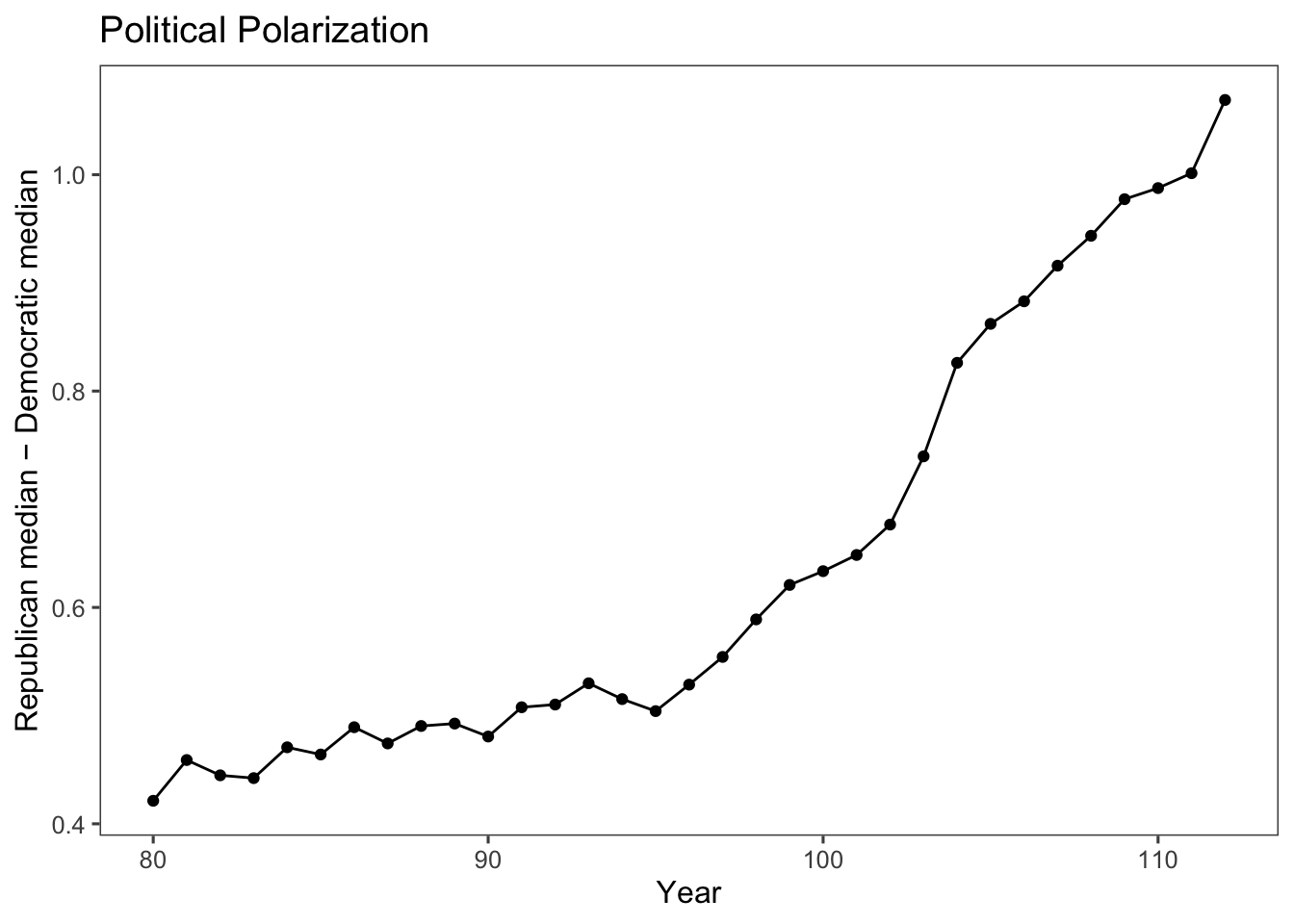
6.6 Gini coefficient: A Representation of the Income Inequality
We can apply our understanding of creating line plots to observe the progression of income inequality in the US over the years. This can be achieved using the Gini coefficient data available in the “qss” package.
The Gini coefficient is a statistical measure used to quantify the level of income or wealth inequality within a population. It provides a numerical value between 0 and 1, where 0 represents perfect equality (everyone has the same income) and 1 represents perfect inequality (one person has all the income, and others have none).
ggplot(USGini, aes(x = year, y = gini)) +
  geom_point() +
  geom_line() +
    labs(x = "Year",
         y = "Gini Coefficient",
         title = "Income Inequality in the US") +
  theme_few()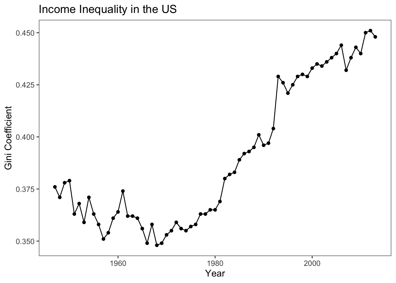
Exercise caution when depicting your data with graphs and interpreting them, especially when it comes to the use of scales. For instance, in the above code, the emphasis was placed on the deterioration of the Gini coefficient in the US, with values ranging from around 0.375 to approximately 0.450. Conversely, the code below highlights a trend that remains relatively stable, indicating neither improvement nor worsening. This is achieved by constraining the range of values shown on the y-axis to the interval between 0 and 1 using the code ylim(c(0,1)). This cautious approach can be especially valuable when you want to focus the visualisation on a specific data range. In this case, it narrows in on the Gini coefficient’s range between 0 and 1, which is the standard range for such a measure.
ggplot(USGini, aes(x = year, y = gini)) +
  geom_point() +
  geom_line() +
  labs(x = "Year", y = "Gini Coefficient",
       title = "Income Inequality in the US",
       subtitle = "(Y-axis Range Between 0 and 1)") + # adding a subtitle to the plot
  ylim(c(0,1)) + # restricting the range of values on the y-axis between 0 and 1
  theme_few()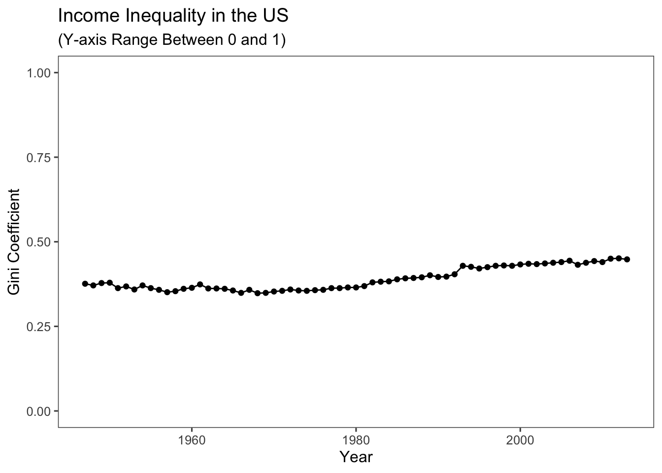
Keep in mind that the United States ranks among the world’s most unequal affluent nations. As suggested by our plots, recent trends indicate that this situation is not showing signs of improvement.
6.7 Interactive R Learning: Lab 6
By now, swirl should be installed on your machine (refer to Section 1.6 if you’re unsure).
There’s no need to reinstall the qss-swirl lessons. Simply commence a qss-swirl lesson after loading the swirl package.
For Lab 6, we’ll work on Lessons “5: MEASUREMENT1” and “6: MEASUREMENT2.”